Centralized Training Style Guide and Site Redesign & Implementation — Partial Case Study
Centralized Training Infrastructure
Centralized Training Infrastructure (CTI) is the result of a partnership between Texas Health and Human Services and UT Health San Antonio, Department of Psychiatry, Communication, Recovery, Research, and Training (CRRT) division. The CTI site is designed to support the delivery of mental health and substance use trainings in Texas.
CTI had a live website through Course Merchant which they used to offered in-person workshops and online courses (the latter through Moodle). However, there were many issues with the website due in part to limitations of course merchant. Among the issues were: organization & navigation of the site, visual design, and a lack of ADA/508 compliance.
I’m the sole web and visual designer for the CRRT group. I work with a small group composed of backend & database engineers and information systems analysts. My role for this project included comprehensive website design, frontend implementation, and branding.
Project Goals
Create a coherent visual design for the site and redesign & implement an accessible website.
Create a style guide for both digital and print assets and distribute to anyone who will be responsble for making any changes to the code.
Redesign and implement the website based on goals and the new style guide.
Ensure that the entire website is ADA and 508 compliant.
Deliverables
Deliverables included a comprehensive style guide, wireframes and mockups for the site redesign, and a live website.
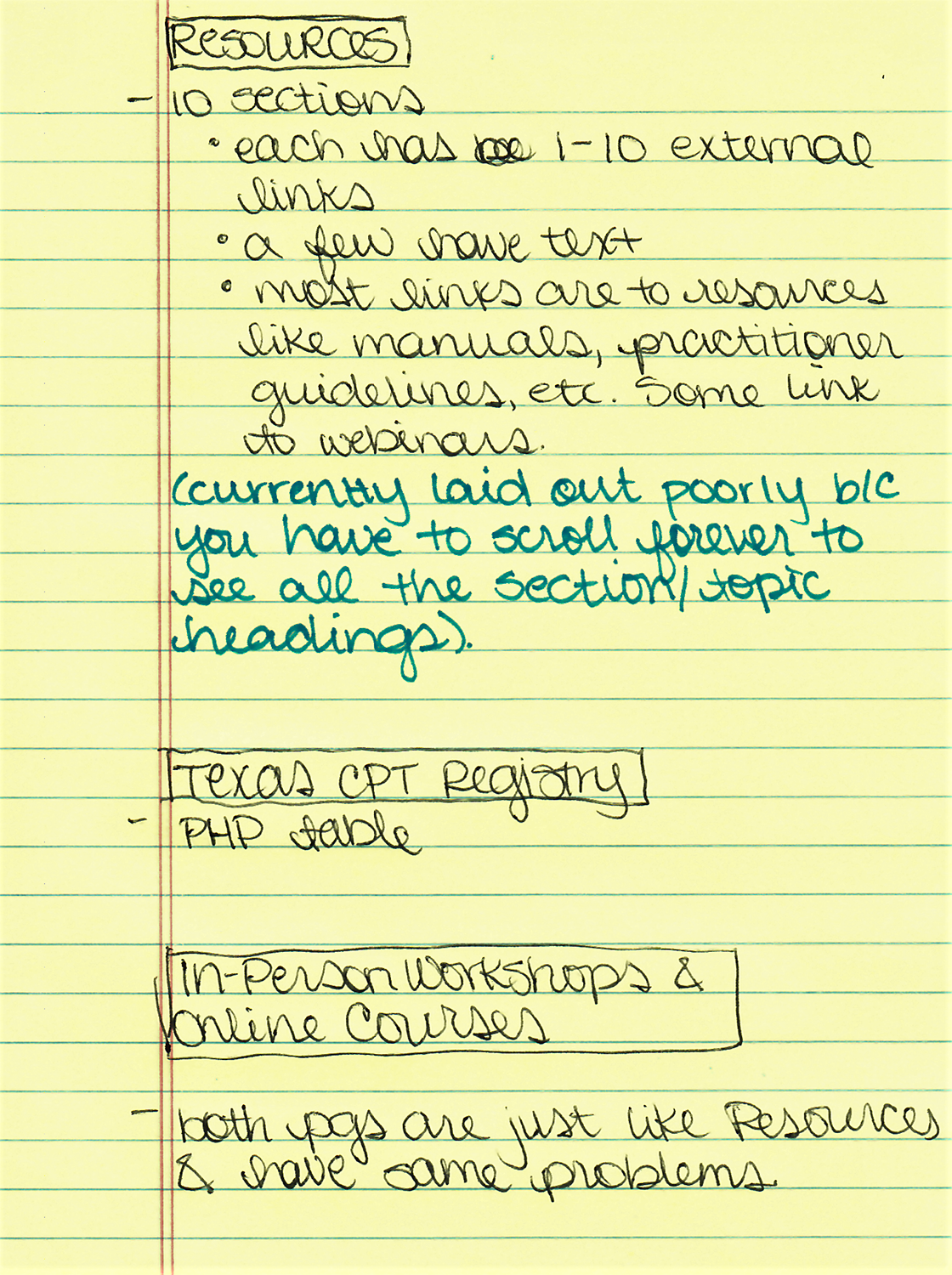
Taking Inventory & Creating Site Organization, Information Hierarchy, and Navigation Structure
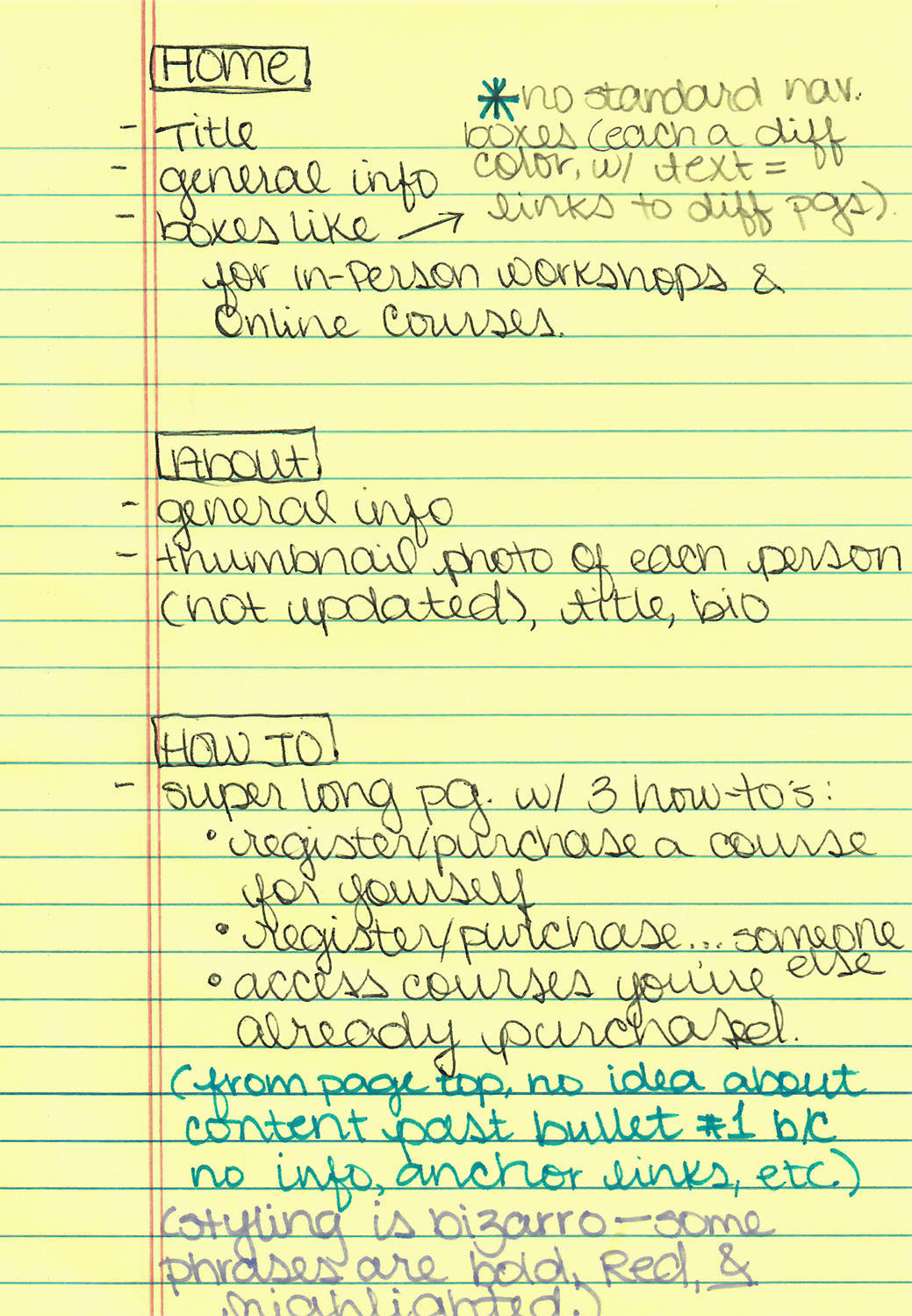
Normally, I begin branding and website redesign projects with a discovery phase. This is when I work toward an understanding of some key elements including:
- Brand
- Users
- Project purpose and goals
- Project scope
- How success toward project goals will be measured
- Constraints
Image 1 – Initial notes on CTI website
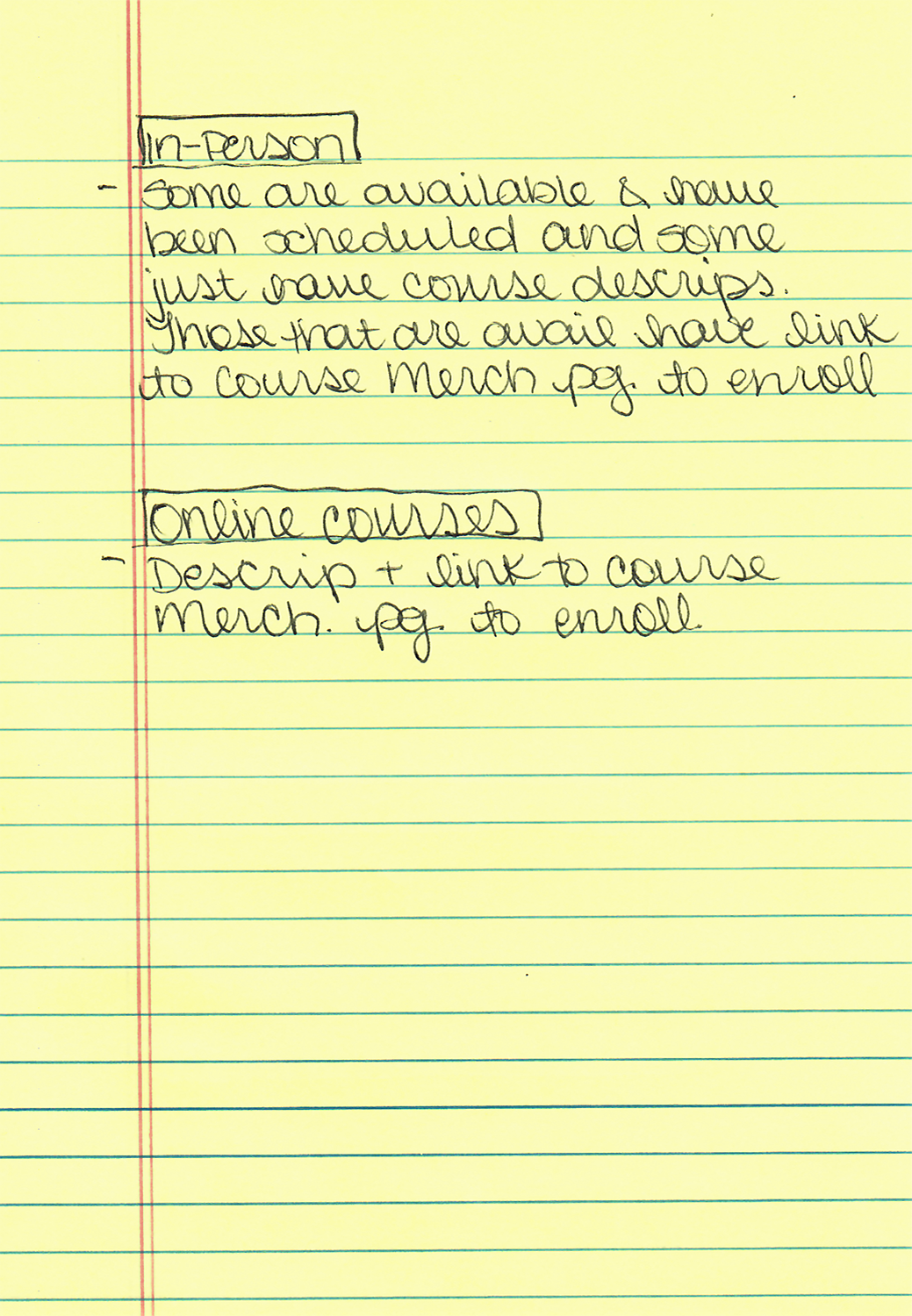
Once I knew what content would be included on the new site, I created the site architecture and laid out the navigation. It was pretty straightforward for this site because the content naturally organized itself into discrete groups.
Image 2 – Site Architecture
Before moving on, I submitted the site architecture for feedback and got the go ahead to continue without making changes.
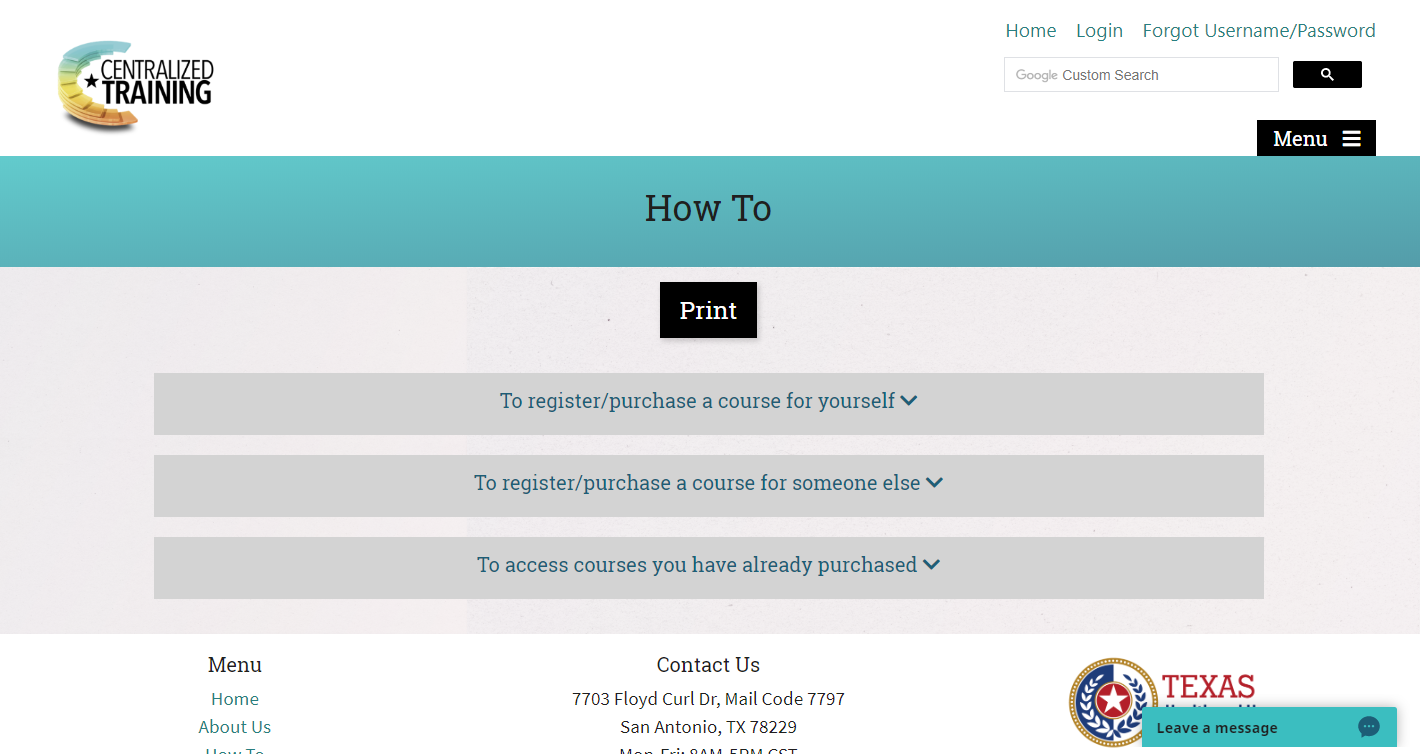
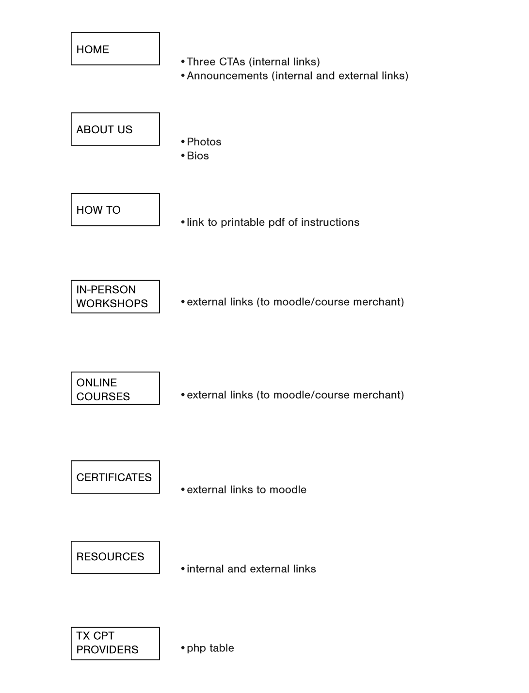
Wireframes: In-person Workshops and Online Courses
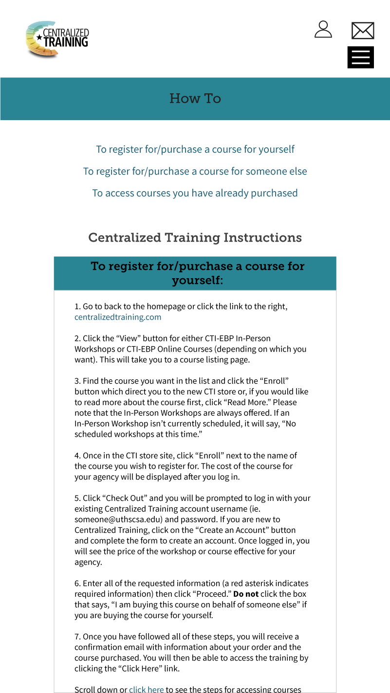
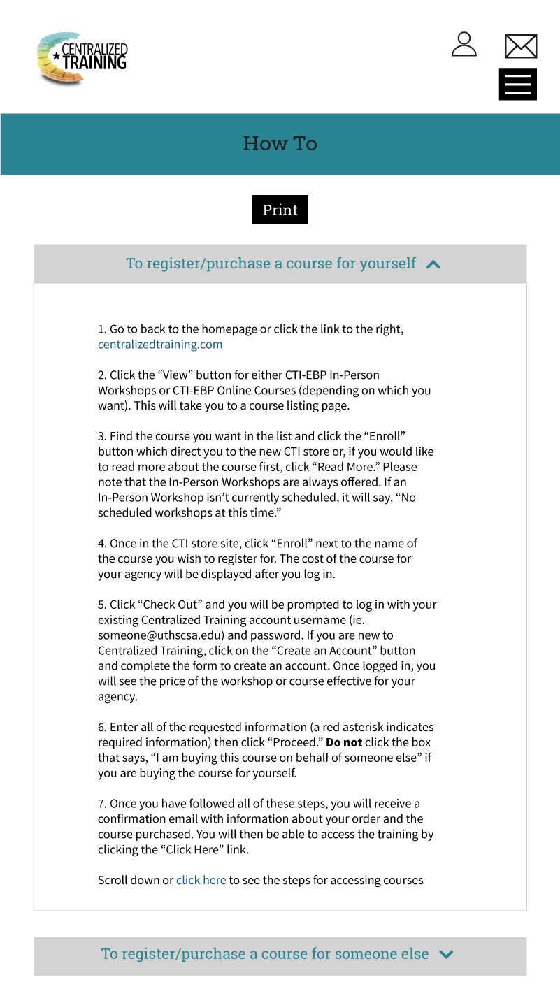
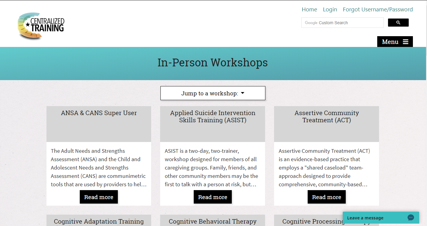
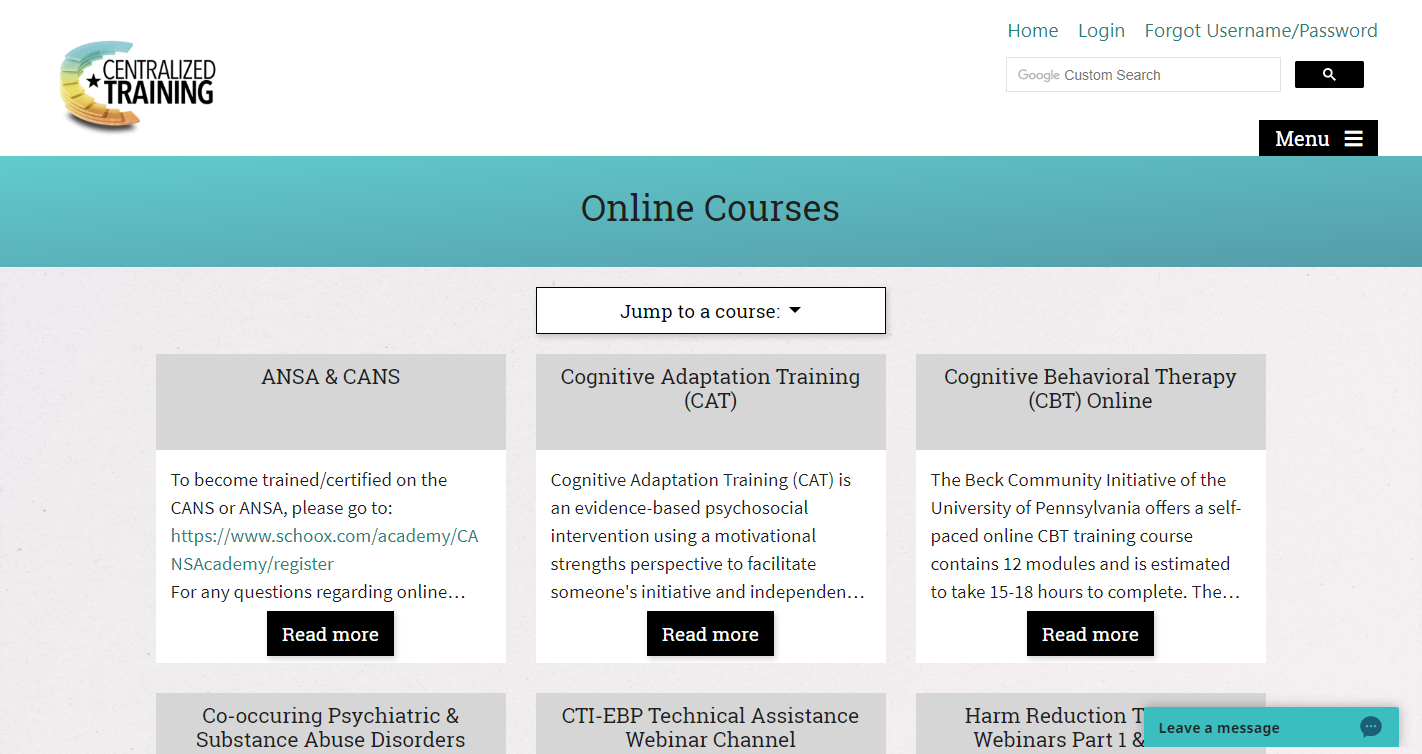
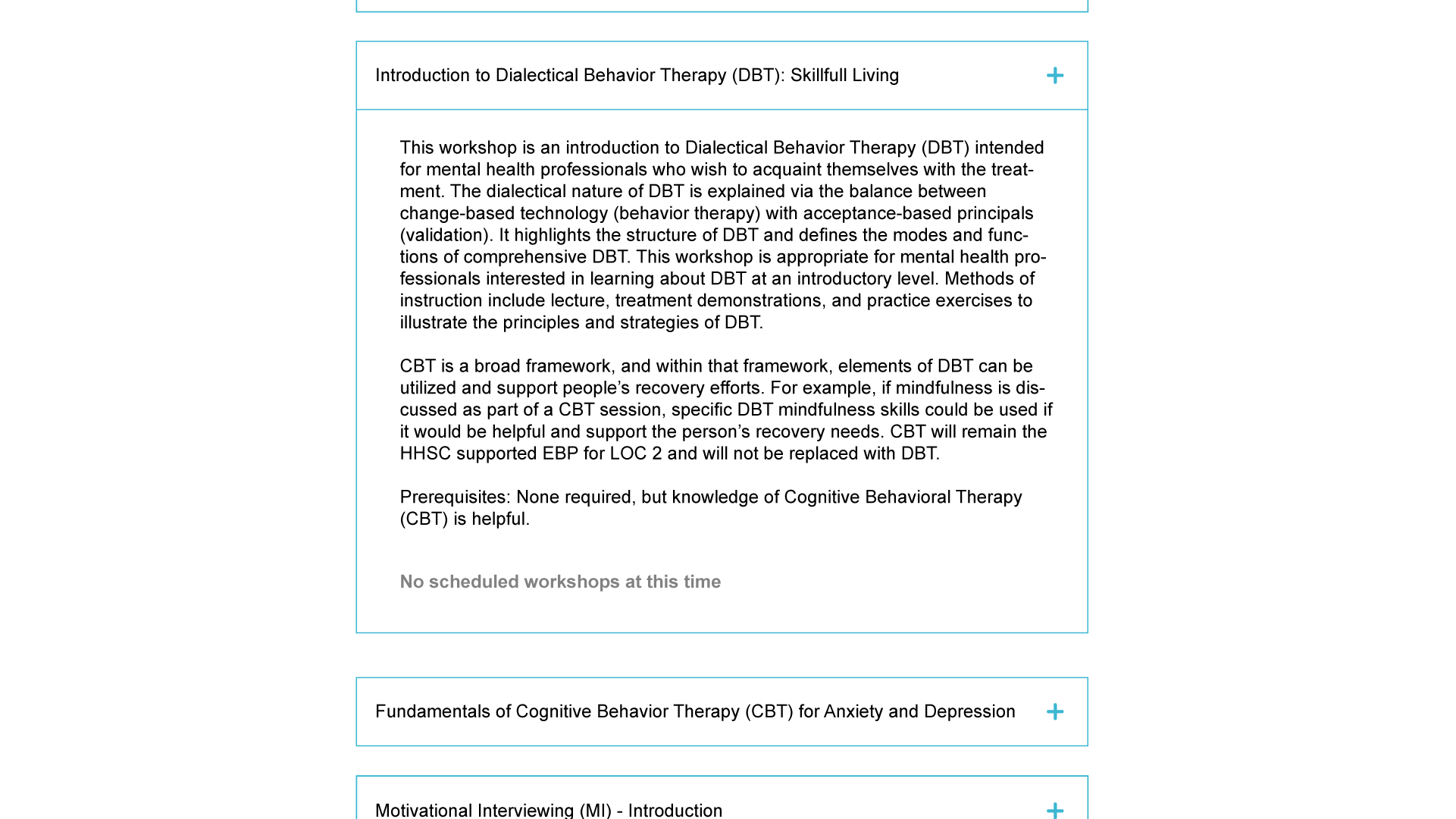
The old website's navigation problems extended beyond site architecture. The way content was presented on many of the site's pages made it difficult for users to accomplish their goal. The In-person Workshops and Online Courses (which have the same page structure and design) are good examples. Both pages should provide users with a list of courses or workshops, descriptions, and a link to enroll or register (where applicable).
As a user, I'd want to see a list of all the courses and know which ones are available immediately after navigating to one of these two pages. With the layout of the page on the old site, this wasn't possible (see below for a rough reproduction of the page).
Image 3 – Rough reproduction of the old In-person Workshops page
There were seventeen online courses available. Each course title was written out in a row with an icon indicating that users could expand the section to see more. Once expanded, users would see a course description. This doesn't sound too terrible yet, right? Well, it gets worse.
At any given time, there are only a few in-person workshops being offered. With the old page layout, users couldn't tell which of the workshops were available without expanding the full descriptions. This obviously makes for poor user experience.
Image 4 – Approximate reproduction of the In-preson workshops page with one of the course descriptions expanded.
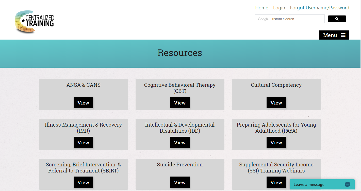
I decided to approach these issues by presenting content differently. Instead of what resembled a list format, I used a card grid for the relevant pages. On the In-person Workshops and Online Courses pages, each card consists of a course title (including - for In-person Workshops - the date of the next schedule workshop where applicable), a brief course description (which cuts off after a certain number of characters), and a button indicating that users can “Read More.” Once the button is clicked, the full course description opens in a modal window. If the course is available, there is an “Enroll” button at the bottom. When a modal is open, the rest of the page content is covered with a dark background at less than full opacity. This way, users’ attention will be directed to the relevant content — what’s in the modal — and reduce distractions thereby lightening cognitive load.
Image 5 – Desktop wireframe for In-person Workshops and Online Courses
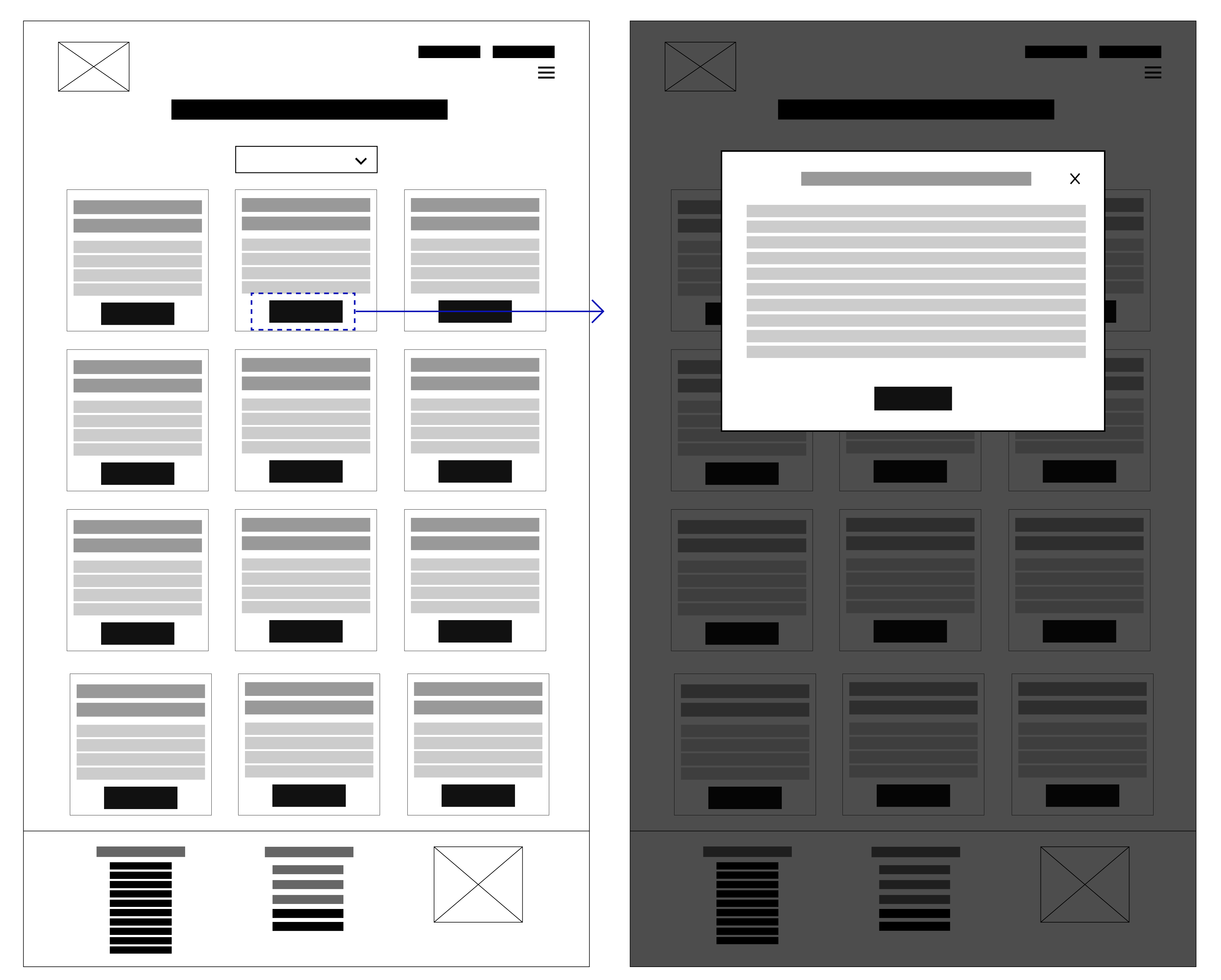
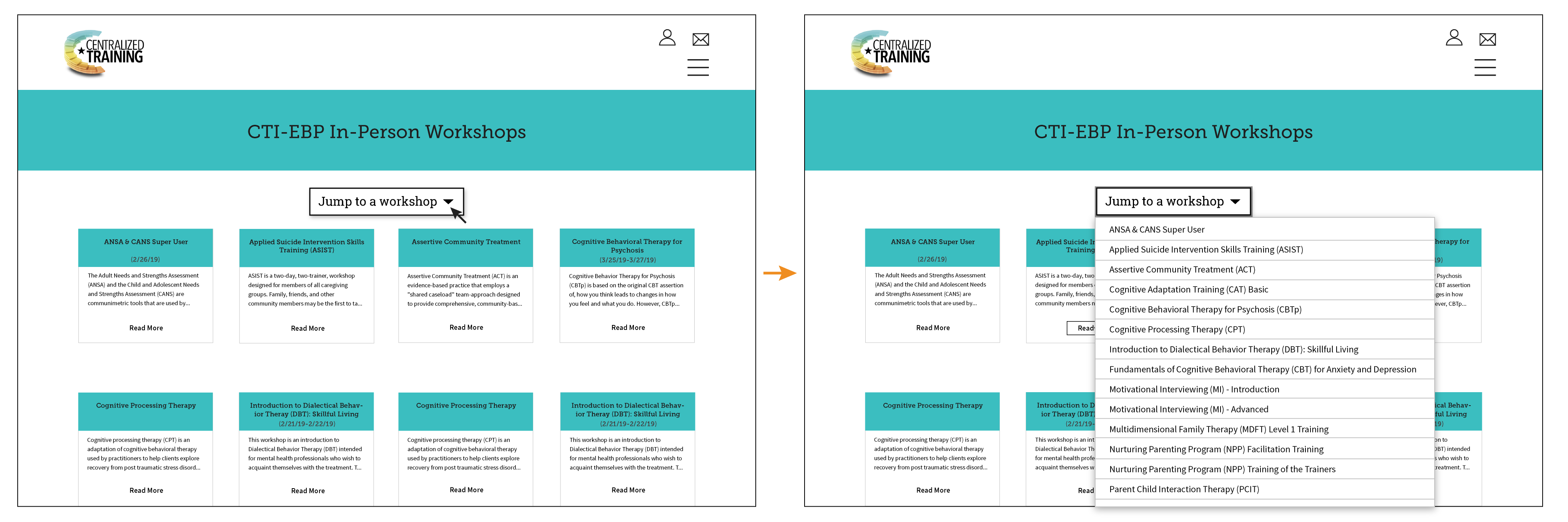
To further lighten cognitive load and to make these pages more user-friendly, I added a dropdown “jump to” button. When the button is clicked, a dropdown list of anchor links appears. Each of the courses or workshops on the page is represented in the list so that if a user comes to the page knowing what course they’d like, they can just click the button, find the course they’re looking for in the list, and click the course title. The page will then auto-scroll to the course they’re looking for.
Designers often leave interactions out of their wireframes, but I think that to have a well thought out, cohesive design, it's critical to consider how a user will interact with a site and its content at each stage of the design process. My approach leads to my considering the relationship of elements on a page to each other and to the whole site. For that reason, I frequently include interactions in my wireframes.
Visual Design
Before turning the wireframes into mockups, I needed to establish visual design for the site and standardize it by creating a style guide. I wanted the visual elements to reflect the desired tone of the site: professional, educational (without being overly academic), and fun.
Color palette
The logo (see Image 6) was one of the site elements that wasn't going to change and it was the basis for the color palette used on the old site. The palette was aesthetically displeasing though it was a little busy. However, it didn’t provide sufficient contrast ratio for accessibility. Instead of working off the old palette, I decided to sample about a dozen or so colors from the logo and create something new.
While the text and the star are black, the rest of the logo consists of a gradient that goes from a green-blue to a melon color. Because there aren’t discrete colors, I began by sampling about a dozen different points along the gradient using Digital Color Meter. From there, I mixed and match to find colors that worked well together and that best fit the personality of CTI. To maximize color accessibility and aesthetics, I didn’t limit myself to shades and tints from the logo though it was the basis for my color choices. With that freedom, there were tons of options. Image 5 shows one of the combinations I came up with that the team (members of CRRT) liked and wanted mocked up.
Image 6 – CTI logo
Image 7 – Color palette
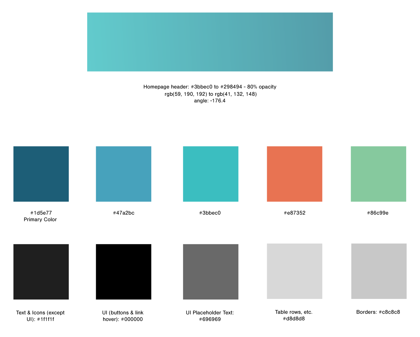
In website design, color palettes shouldn’t be created in a vacuum. The colors will be applied to various elements on the site, and I always keep that in mind. As you can see in one of the palettes in Image 6, I often label the colors to keep track of the elements I’m thinking of using different colors for. This also makes it much faster when I'm plugging in hex codes to check color contrast along the way. The WebAIM color contrast checker is the tool I use most often. Once I have some viable options, my next step in creating a color palette is to apply the colors to a mockup and see how they look and work. That’s just what I did for this site but not before I had some options for typography and various other visual design elements.
Typography
When it came to choosing typeface(s) for the site, my main foci were on having my choice(s): reflect the desired tone, achieve congruence between the typeface(s) & the content; and be legible and aesthetically pleasing.
I began by making a list of contenders and possible pairings. I didn’t automatically assume I’d use two typefaces though that seems to be default for many designers. However, I came to my decision to use two very quickly. I knew the site wouldn’t have tons of photos or graphics, and having two different typefaces would help break up the monotony of lots of text and add visual interest to the site. This was also the reason I eventually decided that using a slab for headings and button text would be a good idea.
After making my initial list, I pared it down and then mocked up the options.
Image 8 – Typography mockup
In order from left to right: Nimbus Sans and Open Sans, Open Sans and Source Sans Pro, Museo Slab and Nimbus Sans, Roboto Slab and Nimbus Sans, Rockwell and Source Sans Pro, Roboto Slab and Roboto, Rockwell and Droid Sans, and finally, Roboto and Source Sans Pro.
In the end, I chose Roboto Slab for the headings and button text and Source Sans Pro for the body. Some of the other pairings used typefaces that are too similar to hit the note I wanted while others just didn’t harmonize with each other. The pairing I chose was right in the sweet spot.
Mockups
Since I had collected most of the content and decided on much of the visual design, creating my initial set of mockups was largely a matter of pulling elements together.
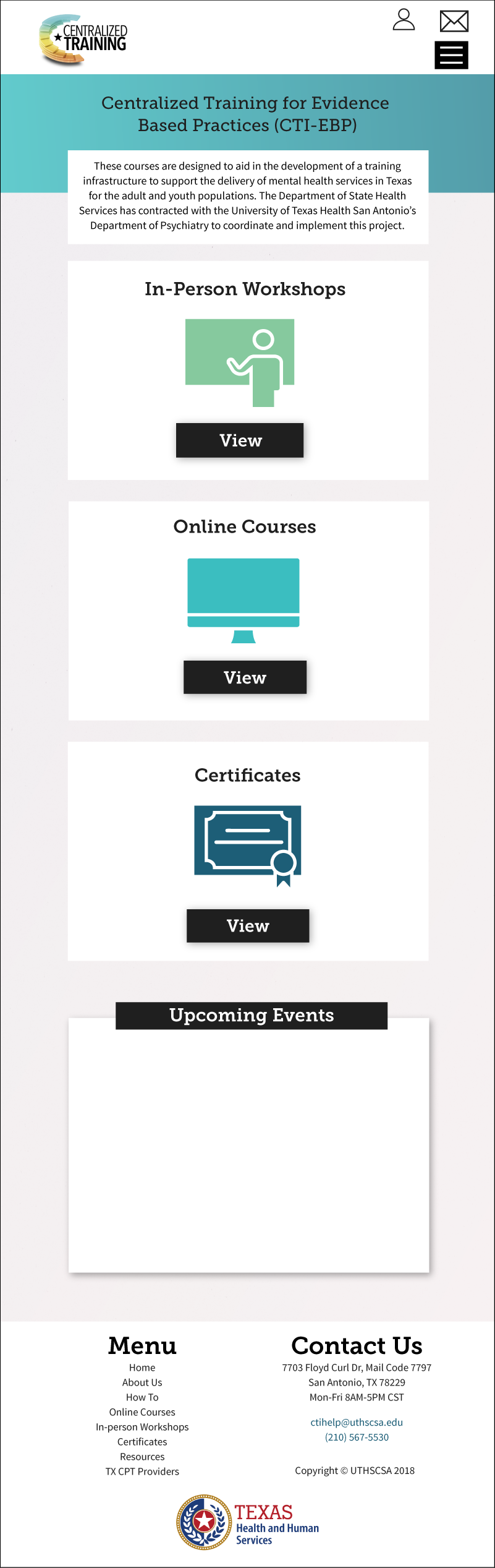
Homepage
Image 7 – Desktop homepage mockup v1.1
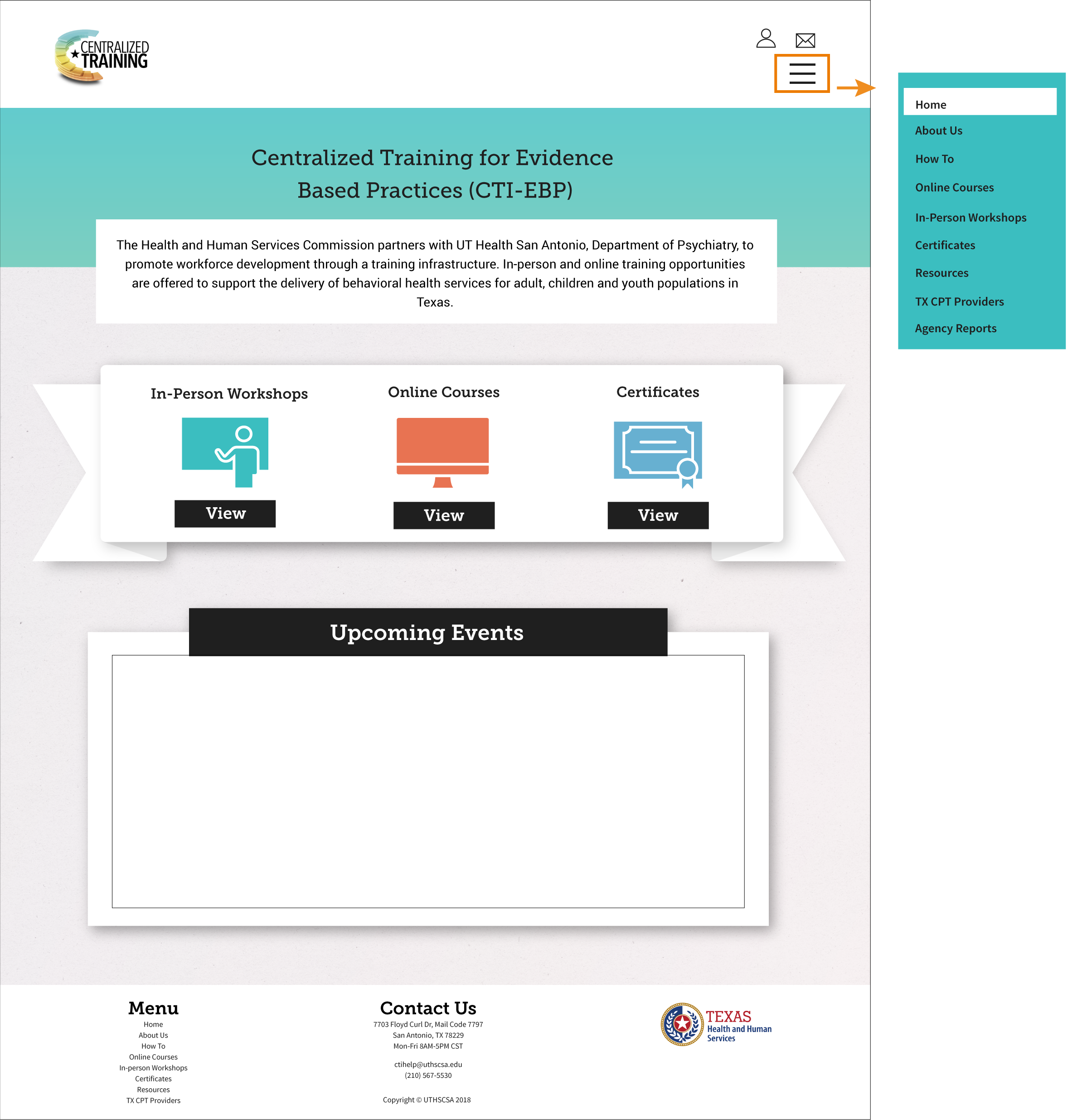
Image 8 – Desktop homepage mockup v3
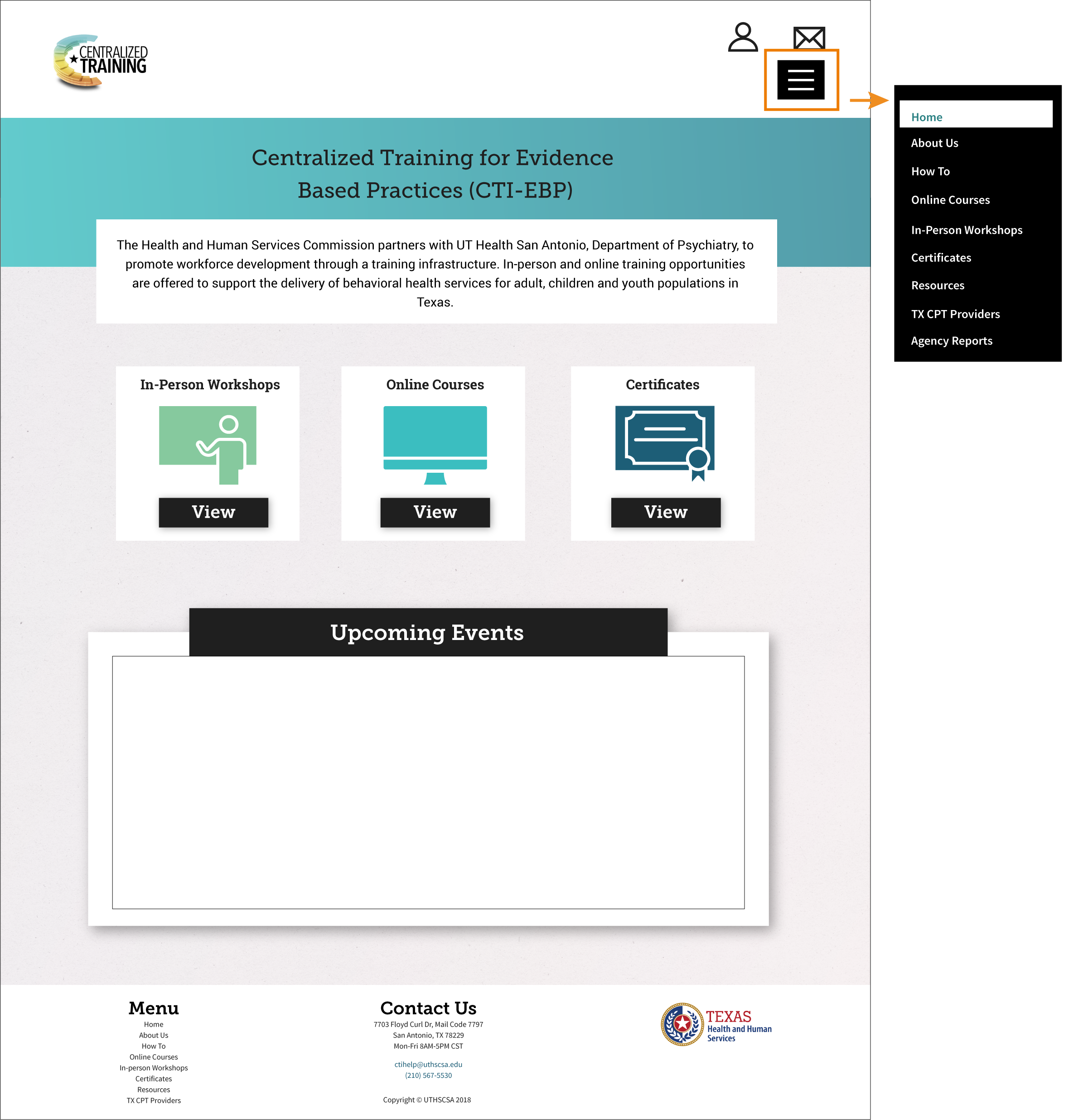
Image 9 – Mobile homepage mockup v3
In-person Courses
Image 10 – Desktop mockup (partial) for In-person Courses
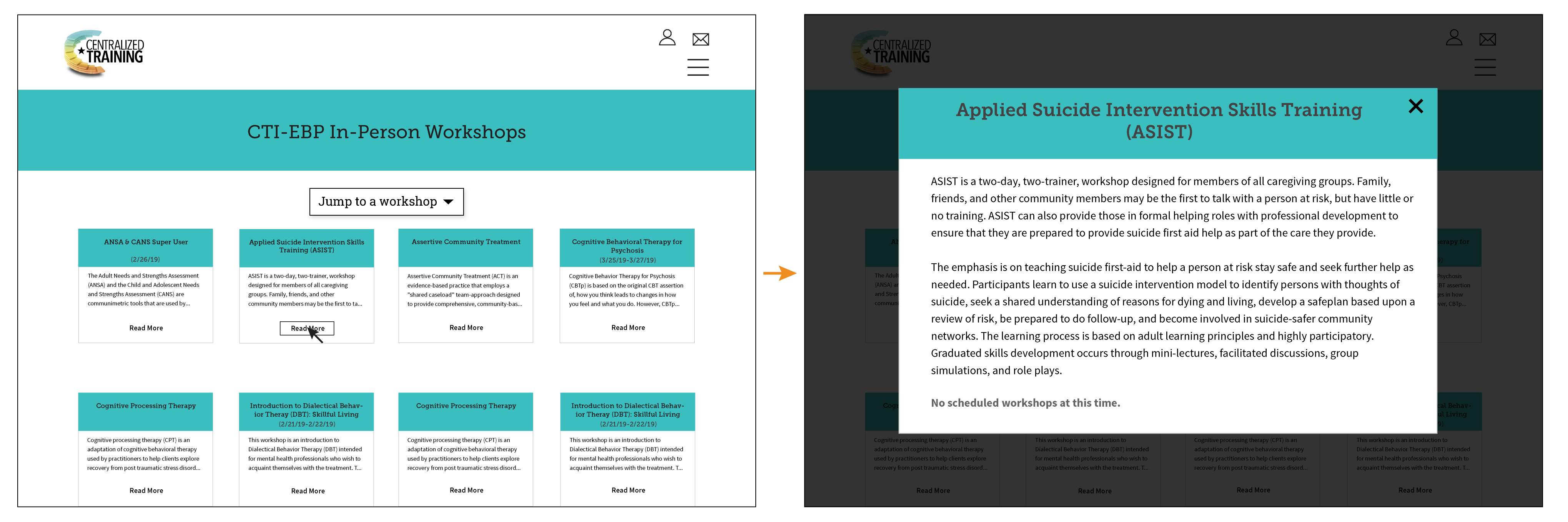
Image 11 – Mobile mockup (partial) for In-person Courses
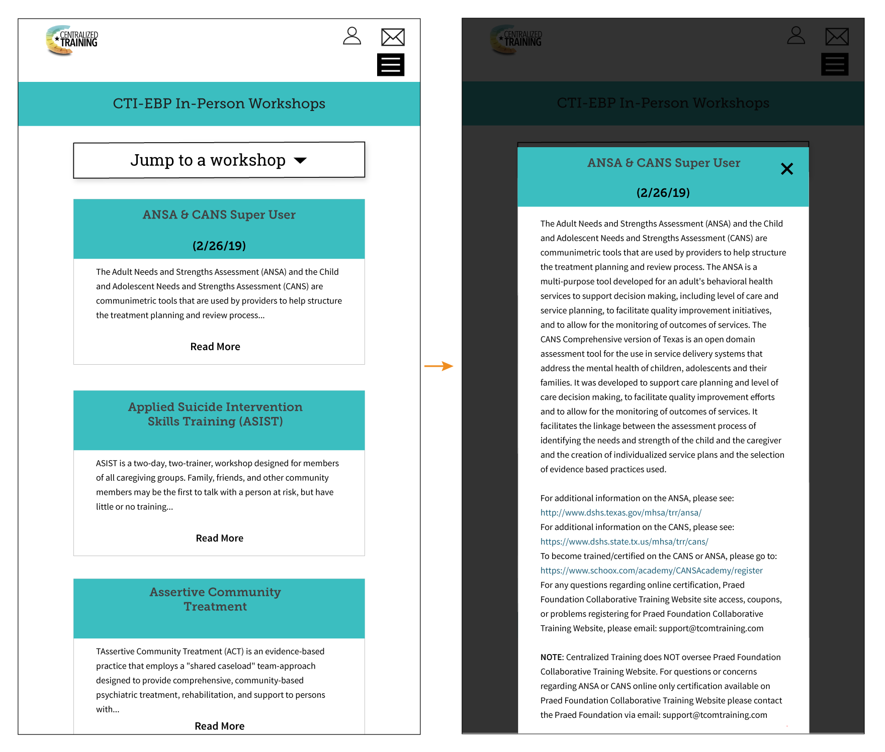
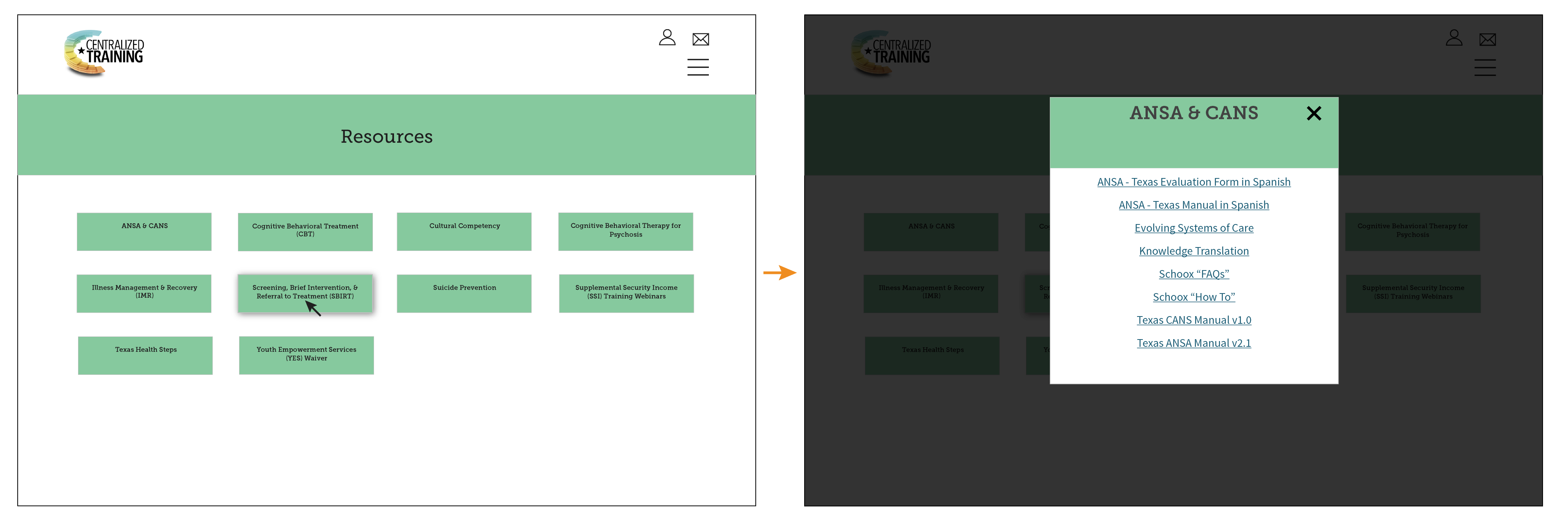
Image 12 – Desktop mockup (partial) for Resources
I think it’s critical to developing good and coherent design to mockup interactions throughout the design process. Doing so allows you to see your idea realized and present the interaction to the client for feedback. Getting that feedback later in the process not only throws off the flow of work but also may require additional changes.
The mockups above don’t illustrate all of the interactions, but they do communicate the more functional interactions like triggering a modal window.
Notable Choices
Because overall the design of this site was fairly simple and straightforward, I won’t go into detail regarding why I made each of the design choices I made. However, there are certain points I feel are worth drawing attention to.
Jump To
For two pages on the site, “In-person Workshops” and “Online Courses,” I added a button just below the header. Selecting the button shows a full list of the courses available on the page. The course titles are anchor links so when a user selects one, they will be taken to the card for that course.
Image 13 – In-person courses mockup with "jump to" button interaction
Menu Button
I realized that our users’ familiarity with tech and the internet was less than I had believed based on some feedback I received on a different site created for the same users. I didn’t want to make assumptions erring on the side of overestimating users’ awareness of common design elements and decided that ensuring usability of the site was more important than avoiding the possibility of introducing some redundancy thus slightly increasing cognitive load.
Image 14 – Menu button with text

I didn’t have to overhaul the design or anything so dramatic. I made some slight adjustments like adding “menu” to the hamburger icon. I also replaced the user account/login icon with text.
Search
In addition to some minor content changes I made to the site after launch, I added a search function to the navigation area to help users’ accomplish their goals on the site.
You can see the site in action at centralizedtraining.com.
Below are more mockups and screenshots of various pages.