Case Study — User Experience & Interaction Design for Filld Mobile App: Integrating OAuth or Third-party Functionality
Filld
Filld is a mobile fueling service for vehicles and fleets wherever they are parked. Filld delivery technicians in safety-compliant trucks follow algorithmically-optimized routes to deliver filtered fuel to vehicles. They currently serve consumers in the Bay Area, Washington D.C., and Vancouver, Canada, and offer B2B service to fleets in the Bay Area, Seattle, Portland, Washington D.C. and Vancouver, Canada.
I was brought on to the project as a freelance designer by a design agency contracted by Filld. I worked as the sole designer on the project under the direction of the design lead.
During this 5-week project, I was responsible for redesigning over a dozen user flows and the associated app screens as well as creating a working prototype.
Project Goals
Incorporate Open Authorization (OAuth)* into the Filld mobile app at multiple integration points to offer users more flexibility within the app.
*OAuth is an open standard for token-based authentication and authorization on the internet.
Integrate OAuth into the sign up flow for new users and the log in flow for existing users.
Incorporate a way for users to import vehicle info into the Filld app from third party platforms.
Redesign checkout and payment flows to accommodate OAuth payment options.
Deliverables
Over a dozen user flows, high-fidelity screens, and a prototype of the user journey beginning with a new user signing up for the app via Lexus OAuth and ending with the user successfully placing an order.
OAuth at Multiple Integration Points
Image 1a - Simplified existing user map with OAuth integration points highlighted
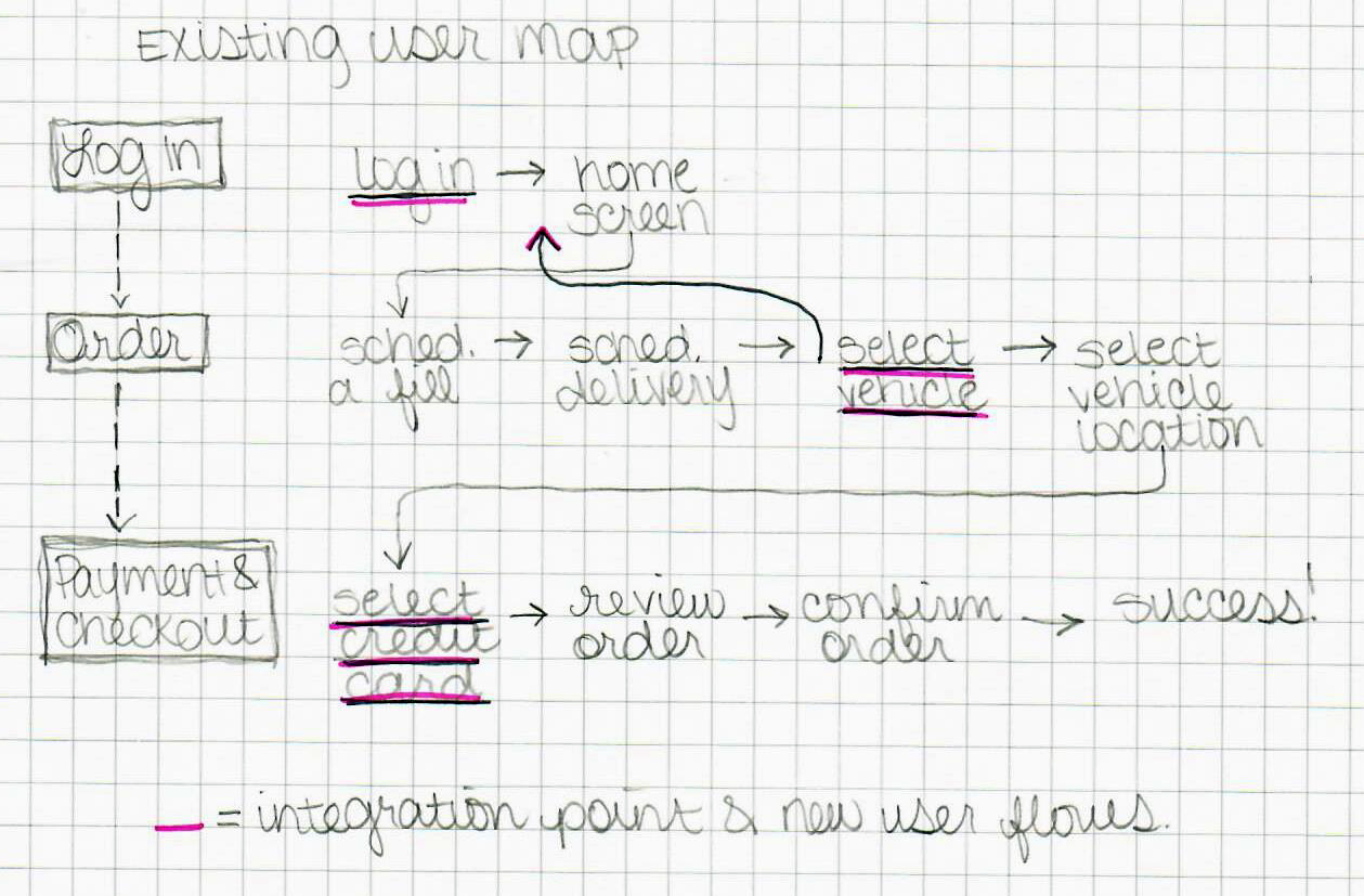
Image 1b - Simplified new user map with OAuth integration points highlighted
Initially, I was asked to use Amazon and Toyota as OAuth partners for the flows. Depending on the OAuth partner, the integration points in the app would differ. For both Amazon and Toyota, I had to redesign the log in and sign up flows. However, since Amazon has a payment options as well — Amazon Pay — I also had to redesign the payment portion of the checkout flow. Toyota on the other hand doesn’t have it’s own payment software, but it does allow users to save vehicle info to their profiles. This meant that I had to devise a way to allow users to import vehicle info from Toyota into the app.
Amazon OAuth: Log In and Payment Integration
Image 2 - Old flow for existing user log in
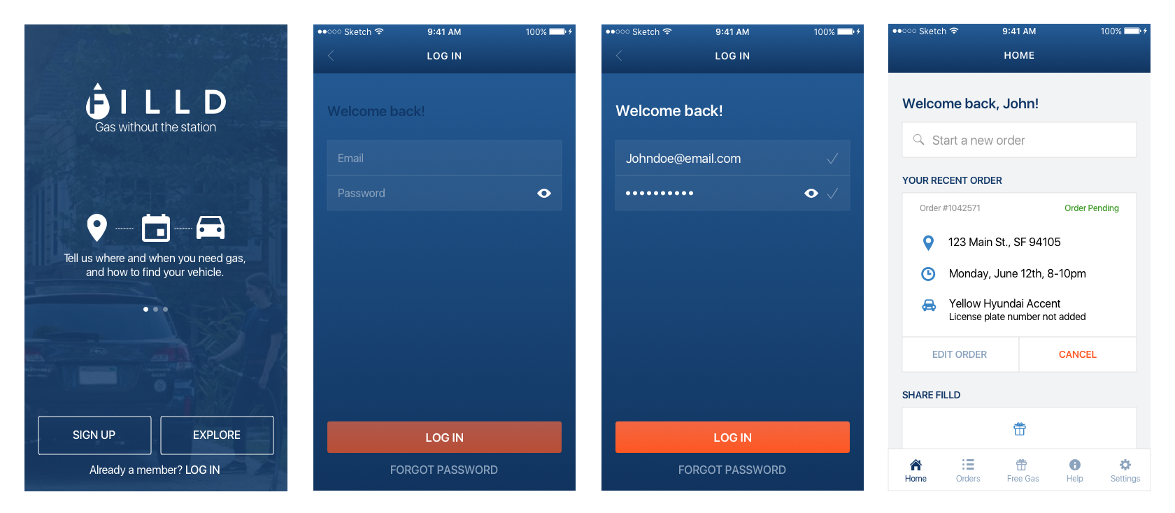
*I did not design the flow pictured in Image 2
Image 3 - Amazon OAuth existing user log in flow
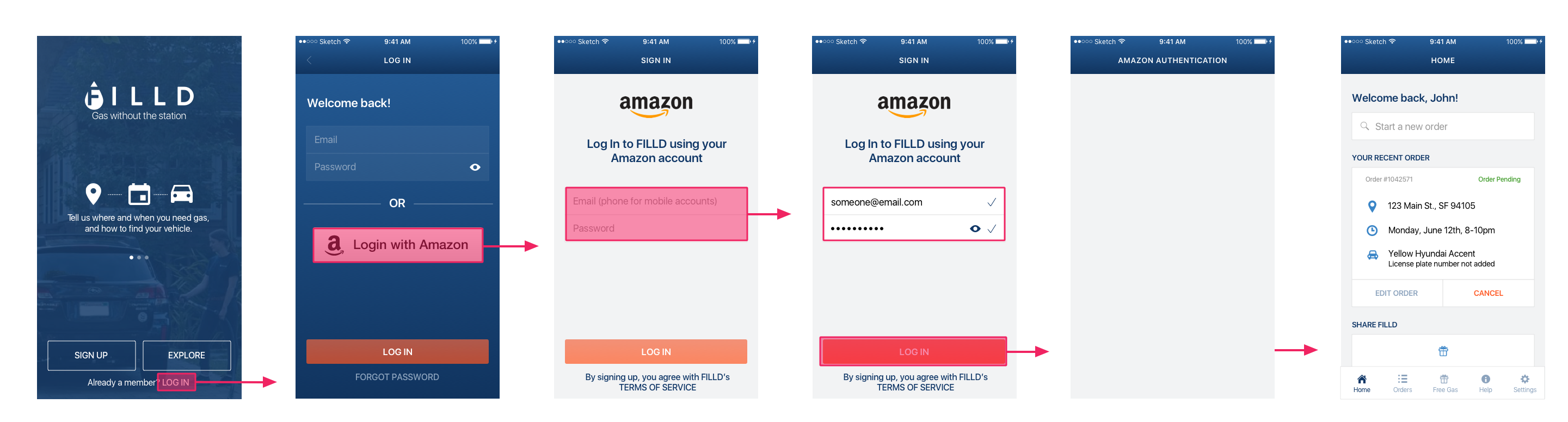
There were two primary directions I could go in with the design of the log in screen: I could duplicate the top section (the email and password input fields) adding "Amazon," or I could add a button or link to take users to a separate screen to log in via Amazon.
The reason I chose the latter was that it was the more minimal approach and this design would immediately draw users' attention to this new log in option. I went with a button instead of a link because it allowed me use more contrast to style the two log in options.
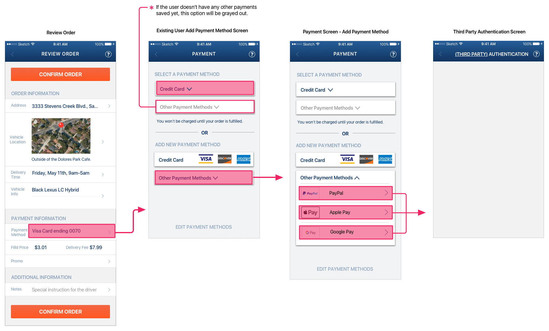
Image 4 - Existing User Select Payment Screen: old vs. new (OAuth)
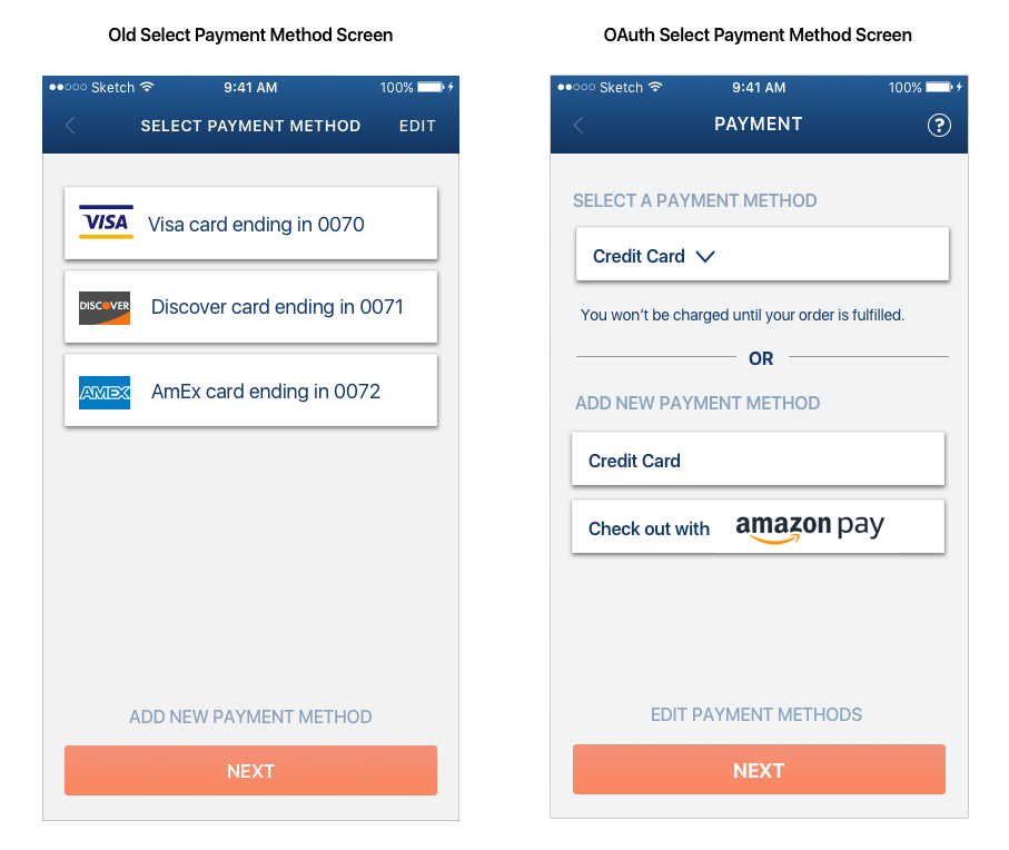
Image 4 shows what the Select Payment Method screen would look like for a user who had credit cards saved to their Filld account but who hadn't added any additional (OAuth) payment methods.
To keep cognitive load manageable, I grouped all of the saved credit cards together. Then, in a layout similar to that of the log in screen in Image 3, I added a section with additional options. Namely, adding a new payment method.
Image 5 - Existing User Select Payment Flow with Amazon Pay Option
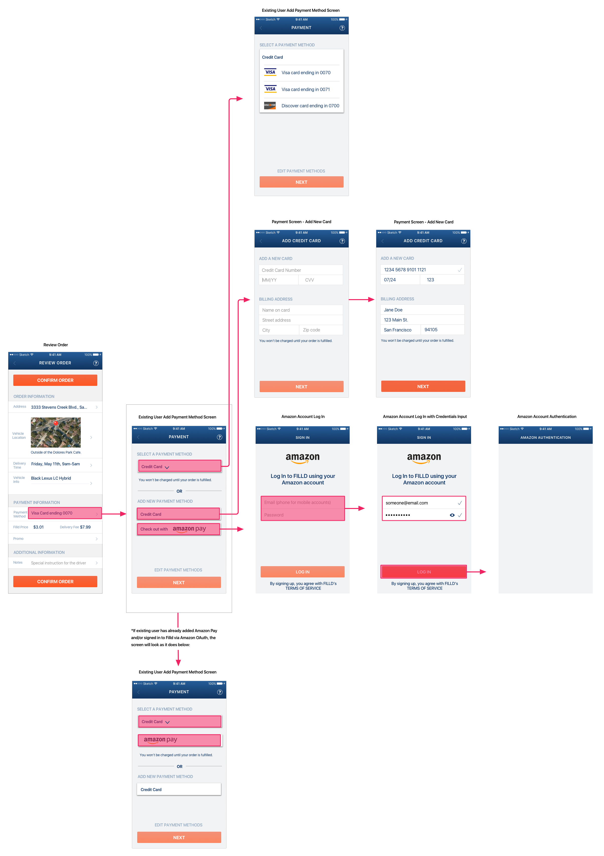
Image 5 shows the payment selection flow with branches for credit card and Amazon Pay methods.
Toyota OAuth: Log In and Importing Vehicle Information
Originally, once a new user signed up with the app, they’d be taken to the home screen. They wouldn’t be prompted to enter any vehicle info until they attempted to place an order or to “schedule a fill.”
With Toyota as an OAuth partner, users would have the option to link vehicles or import vehicle info from Toyota to Filld as part of the sign up process. The goal was to save users saving them time and energy by obviating the need to renter vehicle info. It made sense to offer this option immediately upon successful first time log in to Filld via Toyota.
Image 6 – New user sign up with Toyota and link vehicles
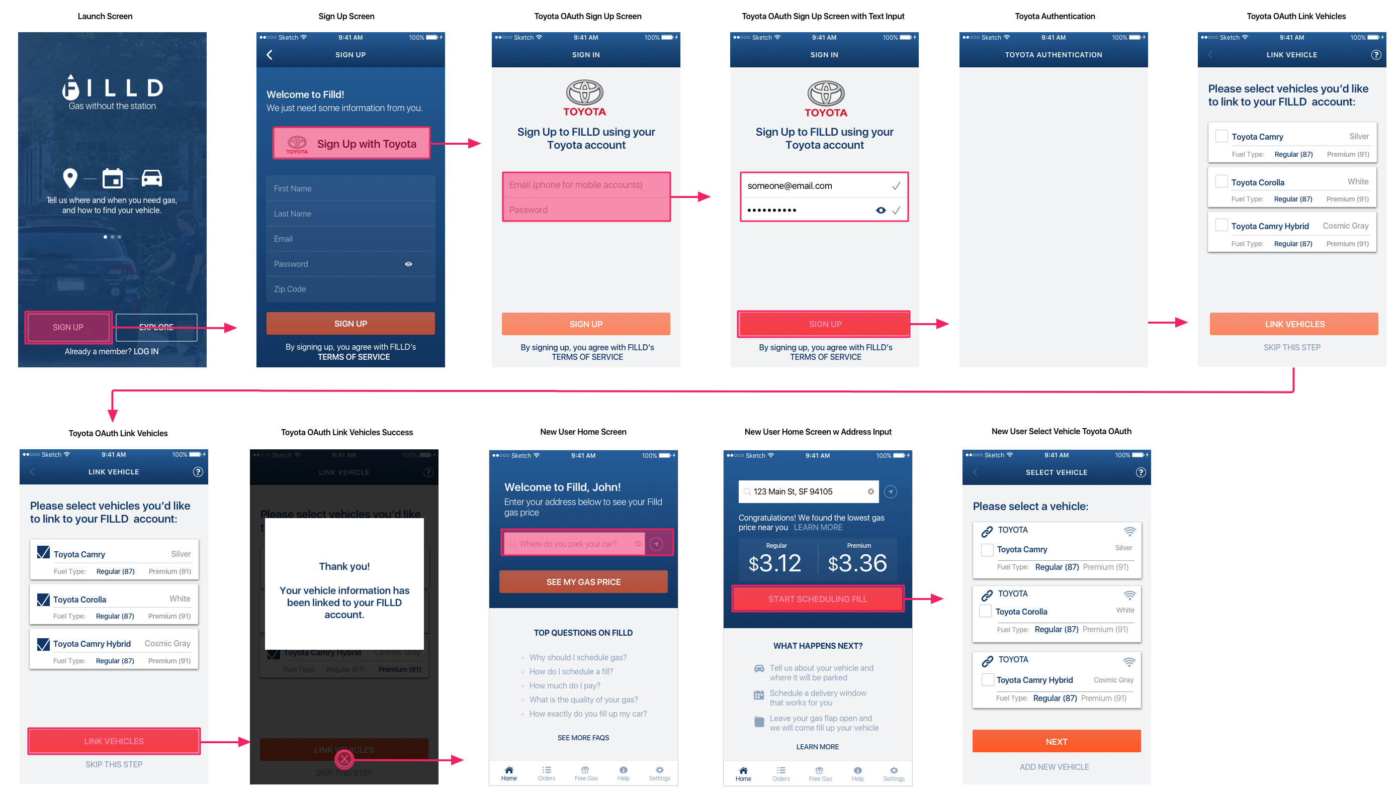
The link icon next to the make of the car on the Select Vehicle screen denotes that the car info was imported from the user's Toyota account.
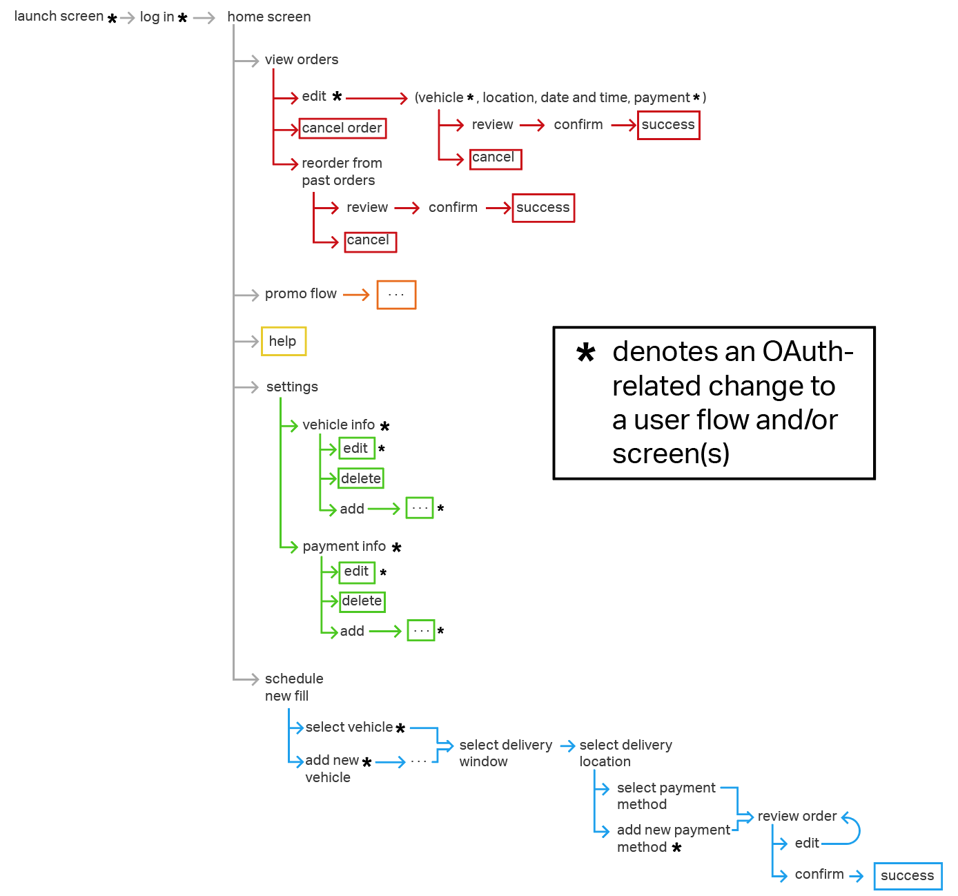
Scalable Log In for Multiple OAuth Partners
After I redesigned the log in and sign up flows with Amazon and Toyota individually, I was asked to make the OAuth log in screen scalable to accommodate multiple OAuth partners.
Image 7 - Version 1 of scalable OAuth log in for existing users
Image 8 - Version 2 of scalable OAuth log in for existing users
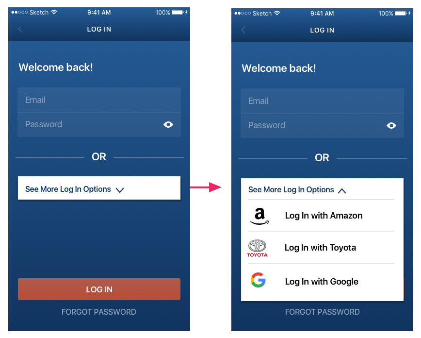
The first version of a scalable OAuth log in screen that I created (Image 7) is a little busy. This detracts from the aesthetics of the screen and adds to cognitive load by presenting the user with potentially more info than is required to complete the task. Moreover, if there were more than three OAuth partners, the user would have to scroll to see them all. I didn’t know how many OAuth partners – if any – would actually be added, but I wanted to design for the possibility.
I addressed both problems in the next iteration by placing all OAuth options into a labeled dropdown. If a user were to tap on the dropdown, all of the OAuth options would be shown. This makes the screen much cleaner and still allows users to access the same info. Hypothetically, it’s possible for an app to have dozens or hundreds of OAuth partners (though of course that's highly unlikely) so at a certain point, nothing could completely obviate the need for scrolling. However, with the design in version two (Image 8), roughly four and a half rows would be visible without users having to scroll. Based on the info I was given, it seemed unlikely that there would even be four partners.
OAuth Payment Flows & Screens
Creating scalable payment screens presented some of the same challenges as the scalable log in screen. Namely, I needed to communicate and present the various options without unnecessarily increasing cognitive load. I began by sketching out some ideas. I then mocked them up, and iterated.
Image 9 – Sketch of scalable OAuth Payment for existing users
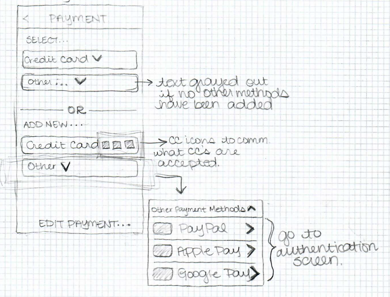
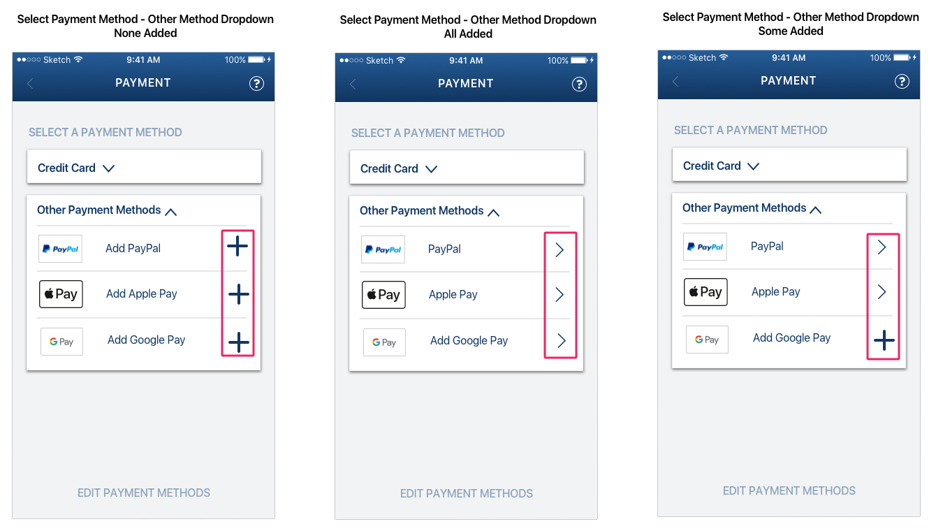
Image 10 - Version 1 of OAuth for existing users
I created two sets of interactions: the first set allows users to select from existing credit cards or other payment methods if they’ve previously set them up. If they haven’t, this option would be gray to indicate that it’s disabled. The second set of interactions allows a user to add a new credit card or other payment method. The dropdown for the latter lists the available options.
While technically this solution worked, I wanted to make the screen simpler and really streamline the payment process. My approach to the payment screen for new users (Images 11 & 12) inspired my final design for existing user payment.
Image 11 – Sketch of scalable OAuth payment for new users
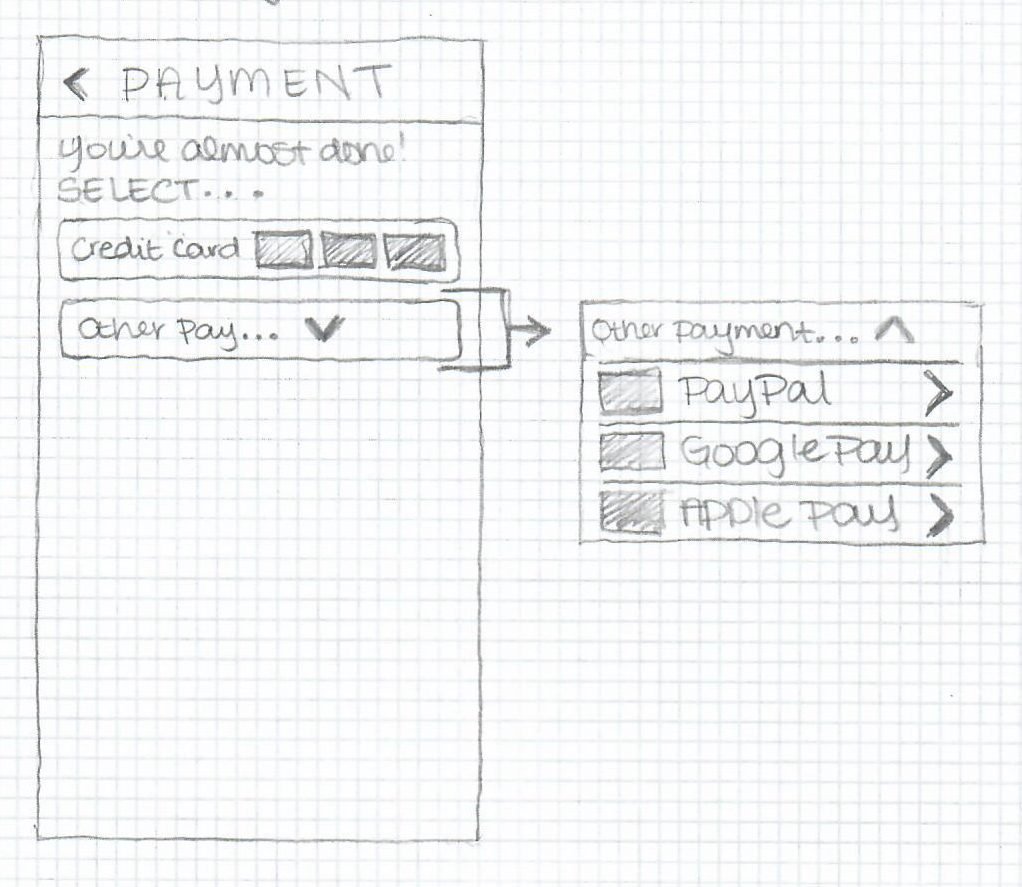
Image 12 - OAuth payment for new users
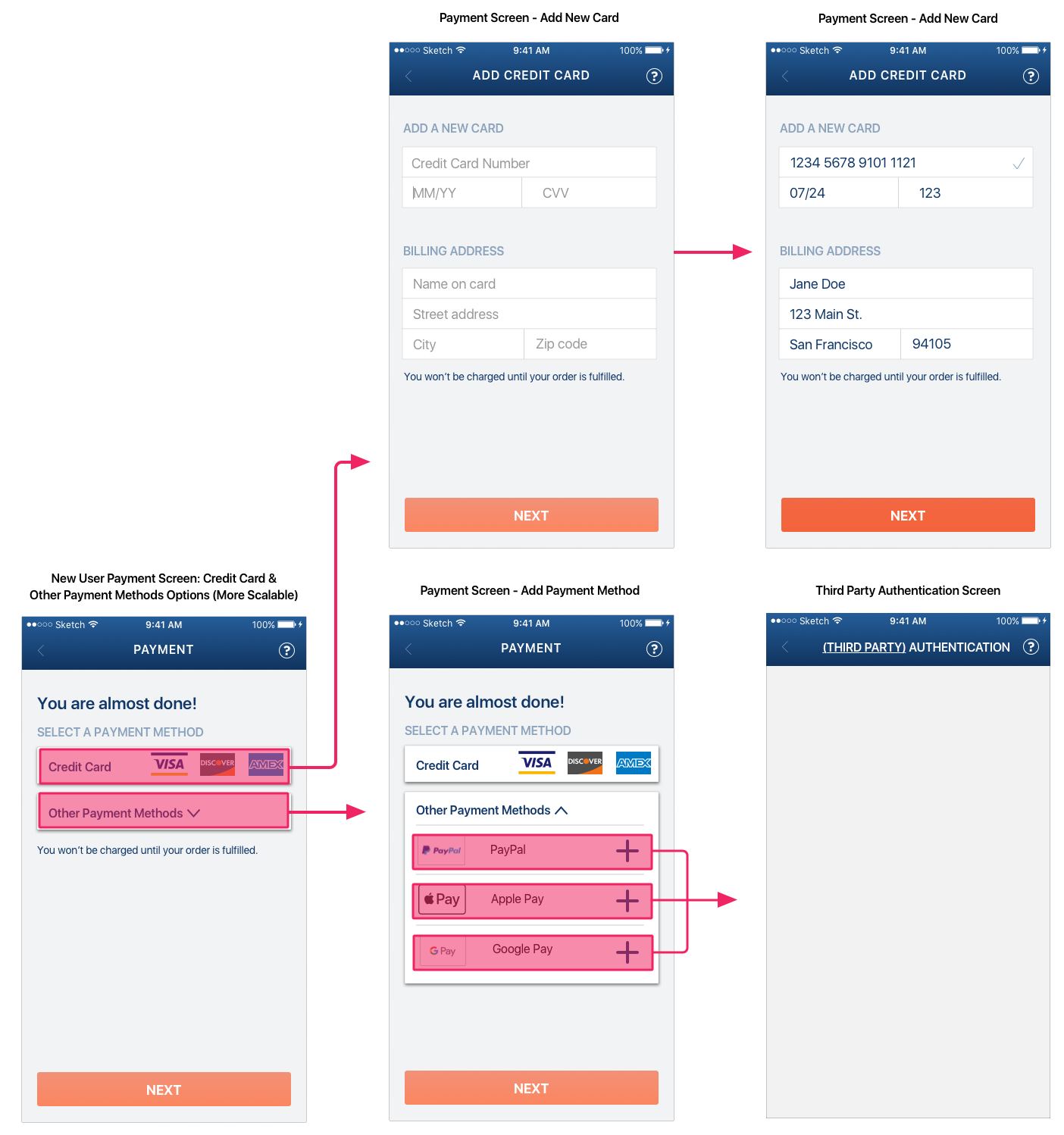
The obvious difference between the new and existing user payment flows is that a new user won’t have any payment methods saved. However, by tweaking the screen a little to make the credit card box a dropdown, I was able to make the idea work for existing users as well. The dropdown would allow users to select a saved card or add a new one.
Image 13 - Final version OAuth payment for existing users
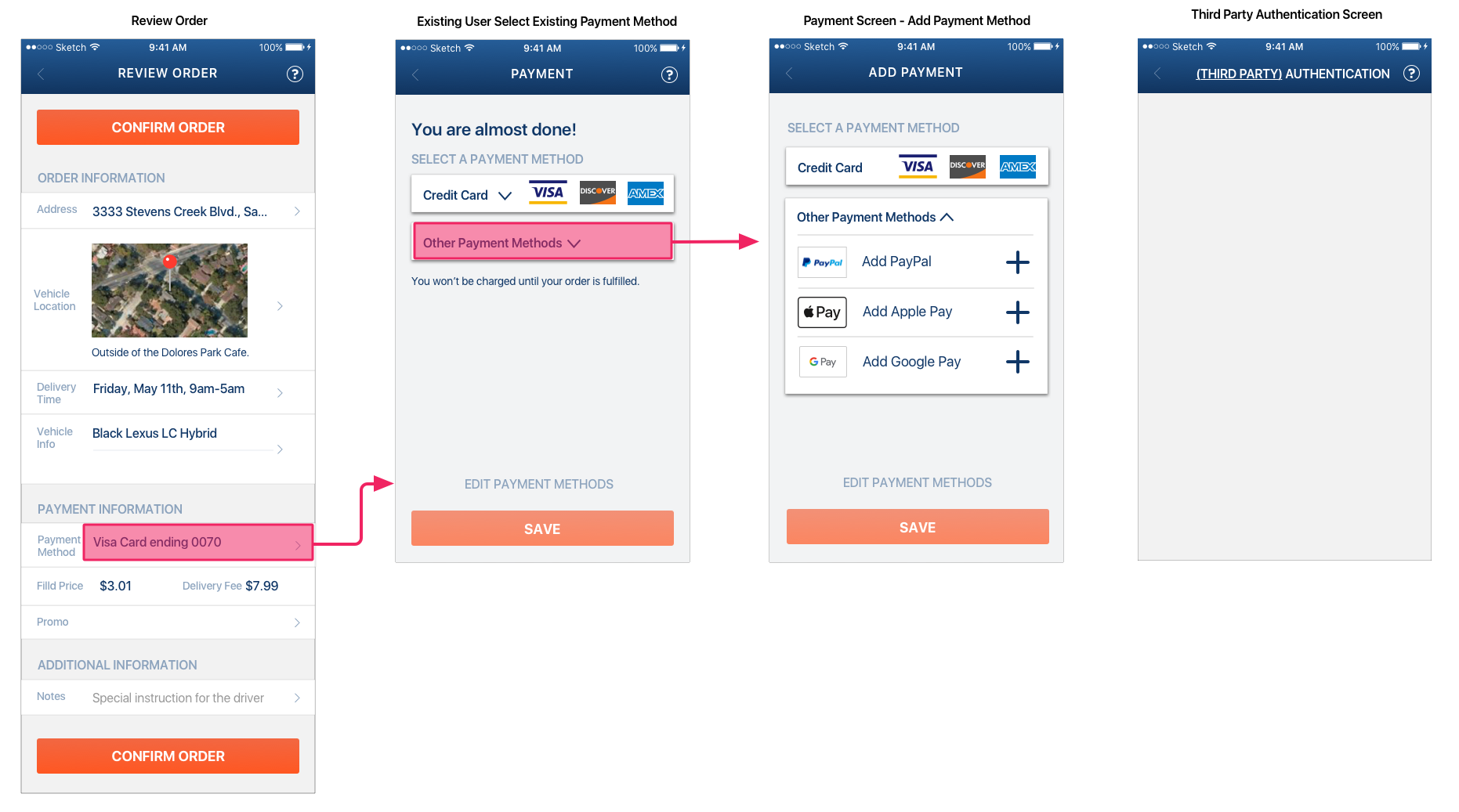
Image 14 - Final version OAuth payment for existing users with screen
In addition to making the existing user payment screen cleaner, using the same approach on payment screens for new and existing users had the added benefit of consistency in design and in interaction, and that’s important to providing optimal user experience.
Lexus OAuth Prototype in InVision
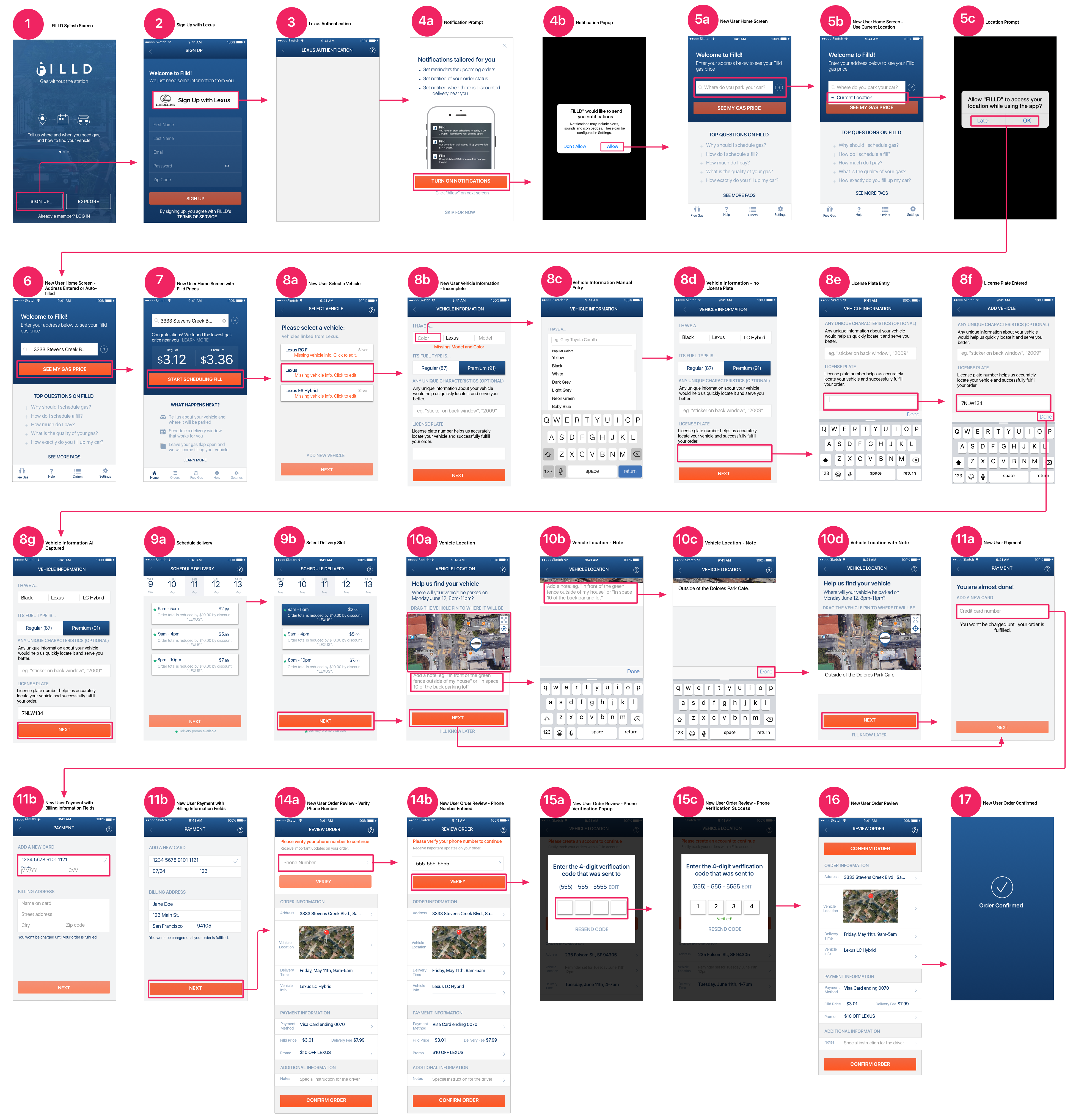
By the time we were wrapping up this project, Lexus had become the most likely potential partner for Filld so the last flow and set of mockups I created centered on Lexus. The flow below outlines the journey a user would undertake from initial sign up with Lexus account through successfully placing their first order.
Image 15 - New user journey Lexus OAuth
You can also see the protoype in action.