Consulting deck template user research
After my team and I created a design for a deck template customized for client engagements, I conducted research to validate whether our direction resonated with our users and met their needs.
How might we figure out what users need and like without directly asking?
Background
Presentations are one of our users’ most common tools for communicating with potential and existing clients. We’ve heard from them that having templates that are customized to Consultants’ needs will allow them to spend more time driving value and will result in high quality presentations.
Participants
- 6 client-facing Consultants and 2 Offering Leaders
- 3 geos represented
- Mixture of growth platforms, industries, and roles
My role
I was responsible for drafting a research plan and guide, conducting sessions, and doing the final synthesis.
I then created and presented a playback for our organization’s leadership and recommended next steps.
Methods
The research was conducted as 1:1 interviews consisting of open-ended questions and a number of activities.
Research objective
Establishing the following:
- What is the makeup of these audiences and how does the users’ approach differ for each (especially in terms of the emotions they’re trying to elicit)?
- What visual elements resonate with users and will best reflect their goals for the different types of decks they create?
- How can we drive adoption of this template? Why do Consultants largely use client templates and branding in decks? How can we motivate change?
Research approach to each objective
Research objective 1
What we knew about our users
They create decks for a variety of audiences with different needs, and their approach to deck creation is customized to their audience.
Research methods
- Open-ended questions about audience makeup and their approach for different audiences
- Cognitive walkthrough of a client deck they created
- Identification of word groups that most resonate with their goals*
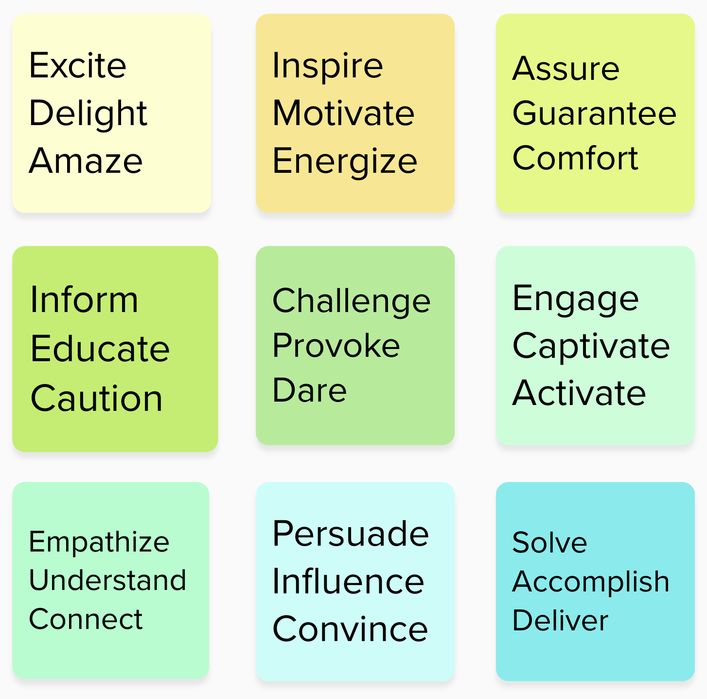
*The word groups we presented were representative of emotions that Consultants try to elicit in presentations. We developed our initial POV based on deck analysis and consultation with experts.
Research objective 2
What we knew about our users
They have difficulty articulating why they do or don’t like visuals and struggle with abstraction.
Research methods
Mental model mapping: Participants match images from an image bank to the words they selected while thinking out loud.
The image bank consisted of ~100 images and featured a variety in terms of:
- Scale
- Concreteness and abstraction
- Color
- Brightness and darkness
- Design movements (industrial, MCM, Swiss, geometric, minimalist, etc.)
After the first two interviews, it was clear that the Consultants were selecting the most concrete, cliché images. This was problematic because it would provide us with less visual direction so we iterated on the image bank.
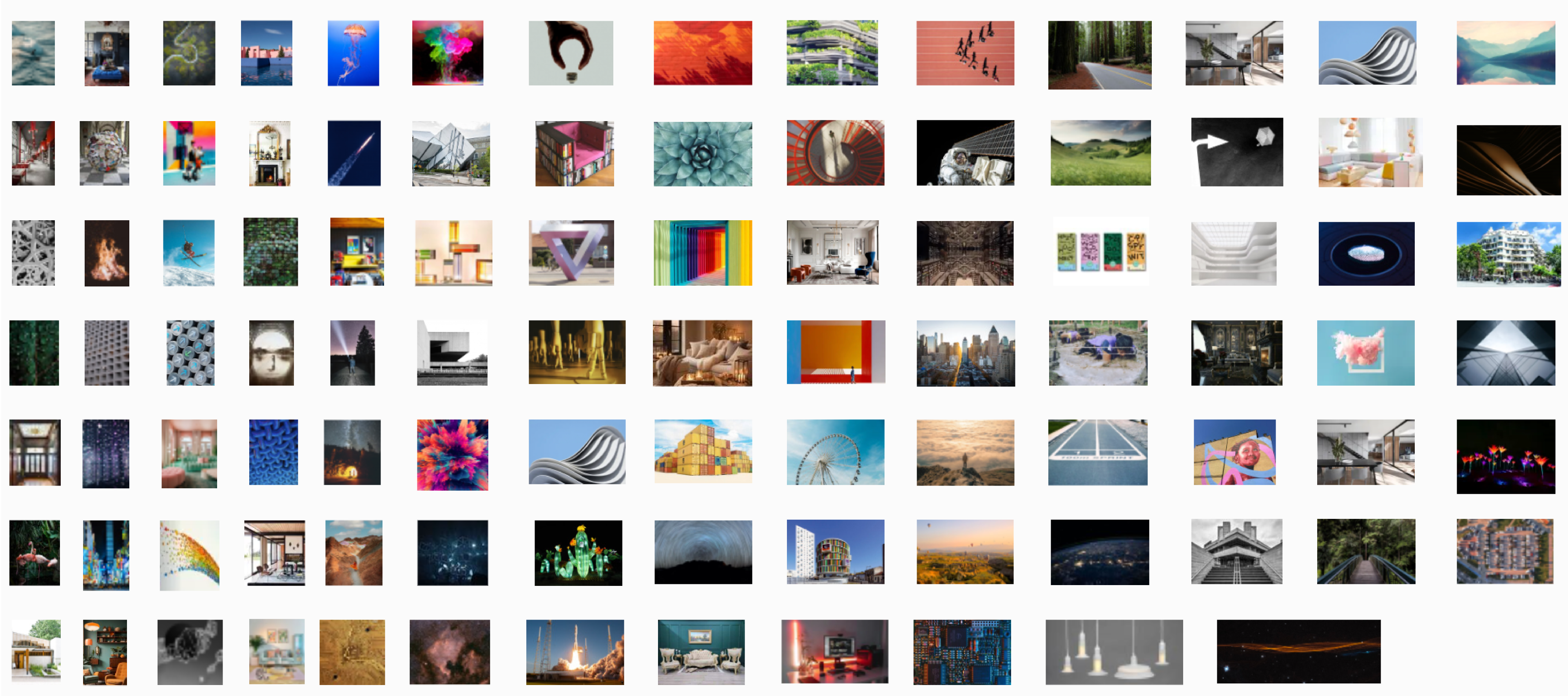
One image bank I created for use in the activities.
Research objective 3
What we knew about our users
They use client templates and/or visual brand elements for most decks.
Research methods
- Ask open ended questions to establish when and why Consultants use client templates and/or branding.
- Brand sentiment evaluation: Participants select images that reflect their feelings about the Consulting brand.
- Discovery of aspirational brand identity: Participants select images that reflect their aspirational vision for the Consulting brand.
- Ask open ended questions to establish comparative brand perception.
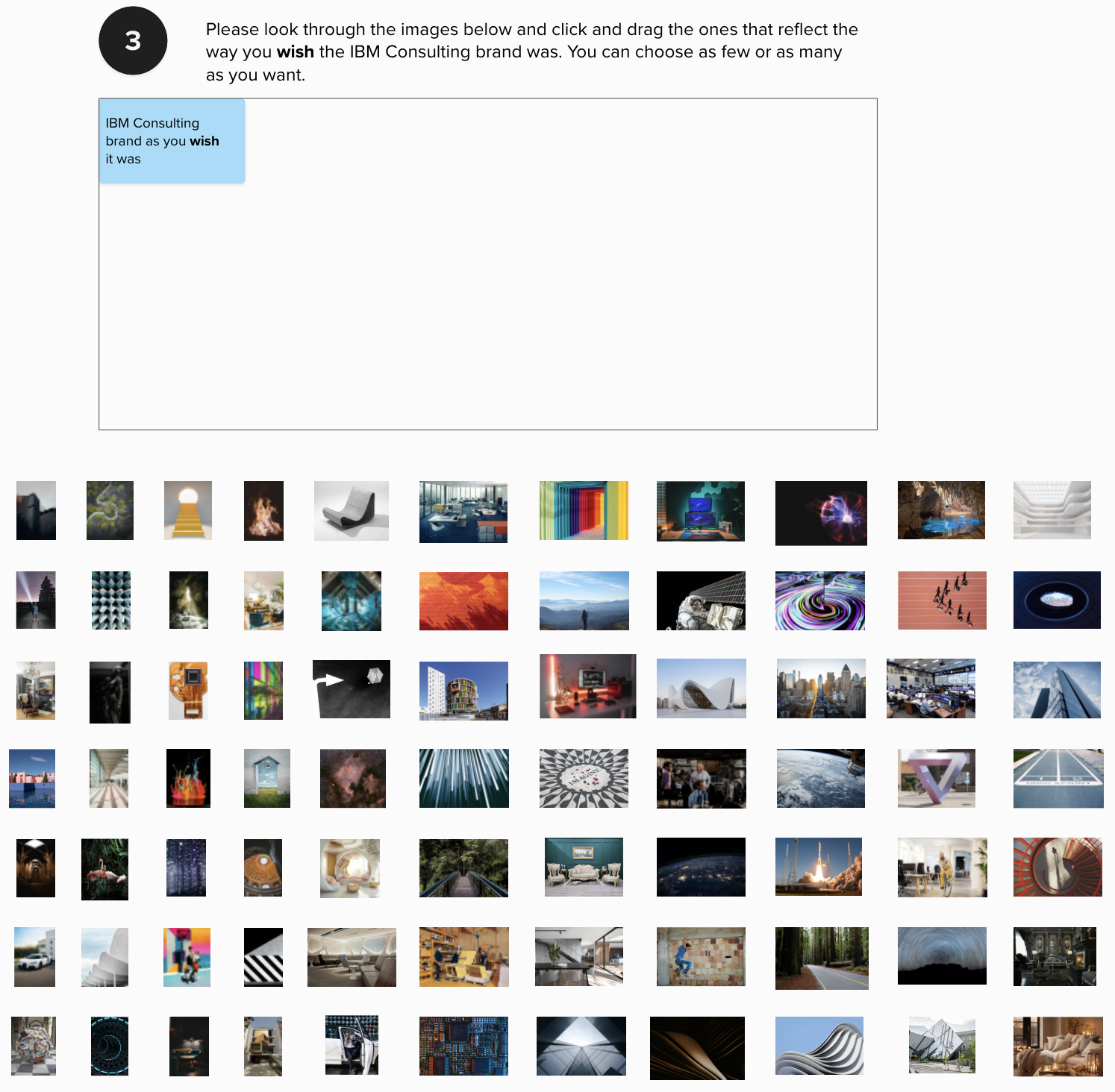
Synthesis
Research objective 1
We got similar answers across the board about audience types and the way users tailor their approach to each. This was reflected in their deck walkthroughs and word group selections.
Research objective 2
By analyzing the images our participants selected, we were able to find distinct themes related to the word groups and to the various audiences.
Research objective 3
By grouping and conducting pattern analysis of what we heard from our participants, I was able to get a much fuller understanding of our participants thoughts and feelings.
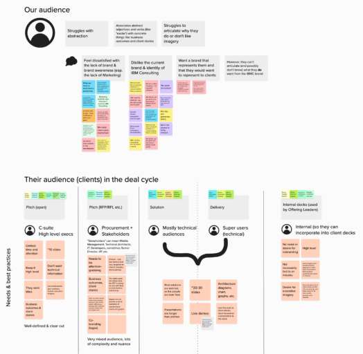
Learnings about our users and their audiences
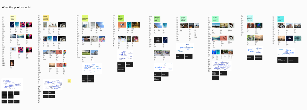
Analysis of the images associated with the word groups

Synthesis of brand sentiment analysis
Recommendations based on learnings and insights
I gleaned a surprising and powerful insight from the synthesis – our participants dislike the Consulting branding and don’t feel it represents them.
Based on this and other insights, I drafted next steps for a playback to our organization’s leadership.
Next steps
01.
Provide a visual expression that resonates with our users and leans into the brand.
Apply learnings about the visual and conceptual elements as they apply to each of the four deck templates.
02.
Craft a presentation templates for each of the different engagement types we identified.
We’ll mirror the approach taken by CPs to ensure we’re enabling them to best meet the needs of different audiences.
03.
Create a Consultant’s journey with enablement for adopting templates.
Enablement will follow the 9 universal principles, allow for use of limited client brand elements when appropriate (i.e. demos and data visualizations of client’s data).
Design principles based on my learnings to guide our next iteration
Clarity and popularity
Communicating information is a key goal of presentations, but it's impossible to communicate anything to an audience that isn't paying attention.
Our goal is to use a visual and conceptual approach that will immediately grab the audience and then maintain their attention. By doing so, we can empower Consultants to get their message across.
Confidence and simplicity
We should be presenting ourselves confidently. Our goal is to enable Consultants to display their expertise with assurance and simplicity.
There is so much jargon floating around that it can obscure what we're trying to say. Jargon doesn't reflect expertise. Instead, it often projects a lack of confidence.
Empathy and collaboration
The brand's promise speaks to accelerating together. Our goal is to enable Consultants to appeal to their audiences on an emotional level and to speak to our understanding of their business and dedication to collaboration.
While are the experts on our solutions, our potential and existing clients are the experts on their own business. It’s important to make space to connect with clients on their pain points and needs and to emphasize moments for conversation and connection between us and the clients.
Show, don't tell
Our goal is to enable Consultants to demonstrate our expertise and success to clients by taking an outcome and evidence based approach.
The best ways to persuade and inspire confidence will be to outline business outcomes we've helped past clients achieve, case studies, and live demos to reflect how our expertise can improve the client's business.