Fuse dashboard interaction design
Fuse
Fuse is a cloud-based inventory management and planning tool that integrates with eCommerce storefronts, warehouses, accounting software and more to centralize data. It uses proprietary algorithms that forecast demand to help companies plan their inventories.
I was brought on to the project as a freelance designer by a design agency contracted by Fuse. I worked as the sole designer on the project under the direction of the design lead.
During the 2.5-month long project, my role included visual and interaction design as well as data visualization.
Project Goals
Enhance the sales tracking page to display more comprehensive information, including both revenue and unit data. Add support for viewing sales data at the individual product level, including component products. Ensure the design presents this information in an intuitive and accessible way, allowing users to easily navigate between data for a given product and its related parent or component products where applicable.
Deliverables
User journies, high fidelity mockups, prototypes, and user interactions.
Design constraints & challenges
When I joined the project, the brand had an existing style guide in place. However, it lacked consideration for accessibility—for instance, some text colors didn’t meet contrast guidelines for visually impaired users, and many font sizes fell below recommended minimums. Despite these limitations, I was required to adhere to the established visual styles.
Another challenge was the absence of user data or access to direct user input. This limited my ability to conduct user research or testing. However, I was informed that users primarily accessed the tool on desktop and laptop devices, which influenced certain design decisions—such as incorporating tooltips triggered by mouse hover.
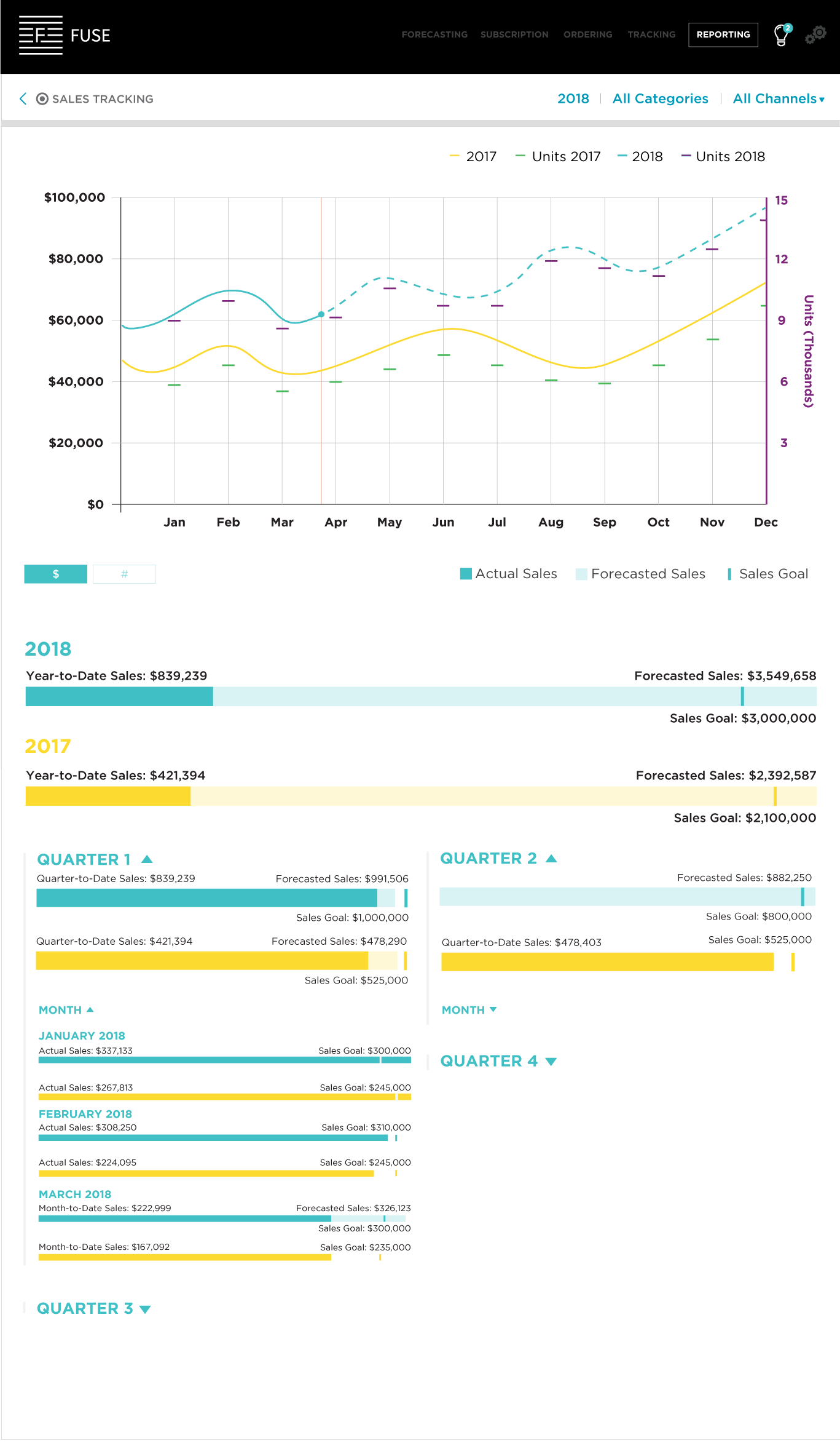
Additionally, Fuse had previously designed a sales tracking page (Image 1) focused solely on inventory totals. I was tasked with using this as a foundation for the new product-level tracking pages. While the existing design offered a useful starting point and helped accelerate initial progress, it also imposed structural constraints on the new layouts.
Image 1 – Original sales tracking page for total inventory sales
Complexity in product types & relationships: bakery example
Let's image a client’s business that functions as a bakery, café, and shop, which sells both finished goods (e.g., cookies, sandwiches) and raw ingredients (e.g., flour, sugar). Products exist in different roles:
- Components (e.g., bread, chocolate chip cookies) are used to make other products.
- Parent Products (e.g., PB&J) are composed of multiple components.
- Variables allow customization within components (e.g., different types of bread or jelly in a PB&J).
- Dual-role Products can be both components and parents (e.g., cookies sold individually and used in ice cream sandwiches).
Approach to unit and revenue display
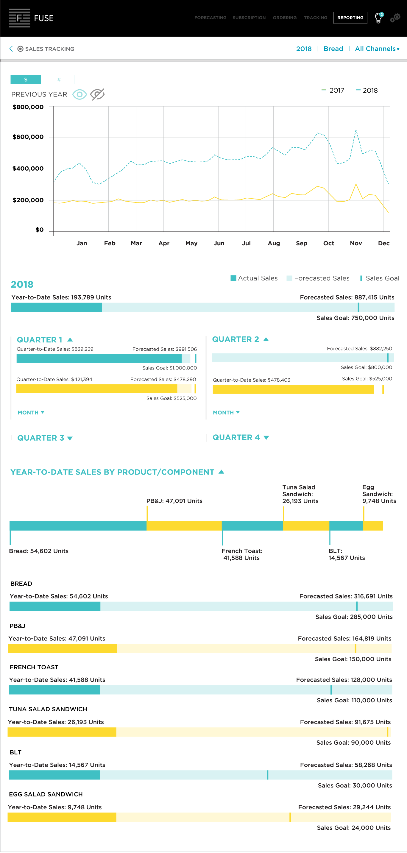
I began by addressing how to present both unit and revenue data, as the primary element on the page was a line graph showing monthly sales. Starting with pencil-and-paper sketches, I explored several layout options, including a dual-axis line graph that could display both metrics simultaneously. Since the original design already used a line graph to display revenue, maintaining this format ensured consistency for returning users while also providing a high-level overview of key data.
After creating mockups (Image 4), I found the dual-axis approach to be visually cluttered and potentially confusing. To simplify the experience, I introduced toggle controls (Image 5) that allow users to switch between views—showing either units or revenue—based on their preference. This solution offered greater clarity while still giving users access to all relevant information.
Image 4 – Mockup of dual y-axis chart and unit and revenue toggle
Designing interactions to avoid cognitive (over)load
My challenge here was to create a design that would communicate to users what info they could access without putting too great a strain on cognitive load.
Cognitive load is the amount of mental effort required to complete a task. It’s increased by anything that gets in the way of said task. This includes ambiguous design, having too many choices, and poor organization of content. There are a variety of ways of decreasing cognitive load beyond just avoiding the things I listed. For this project, I was particularly mindful about doing the following:
- Streamlining actions and interactions to eliminate unnecessary complexity.
- Striving for simplicity while maintaining clarity in design.
- Organizing content logically to enhance usability and navigation.
- Prioritizing relevant information in both layout and navigation.
- Employing familiar visual cues and interactions to minimize cognitive burden for users already familiar with the interface.
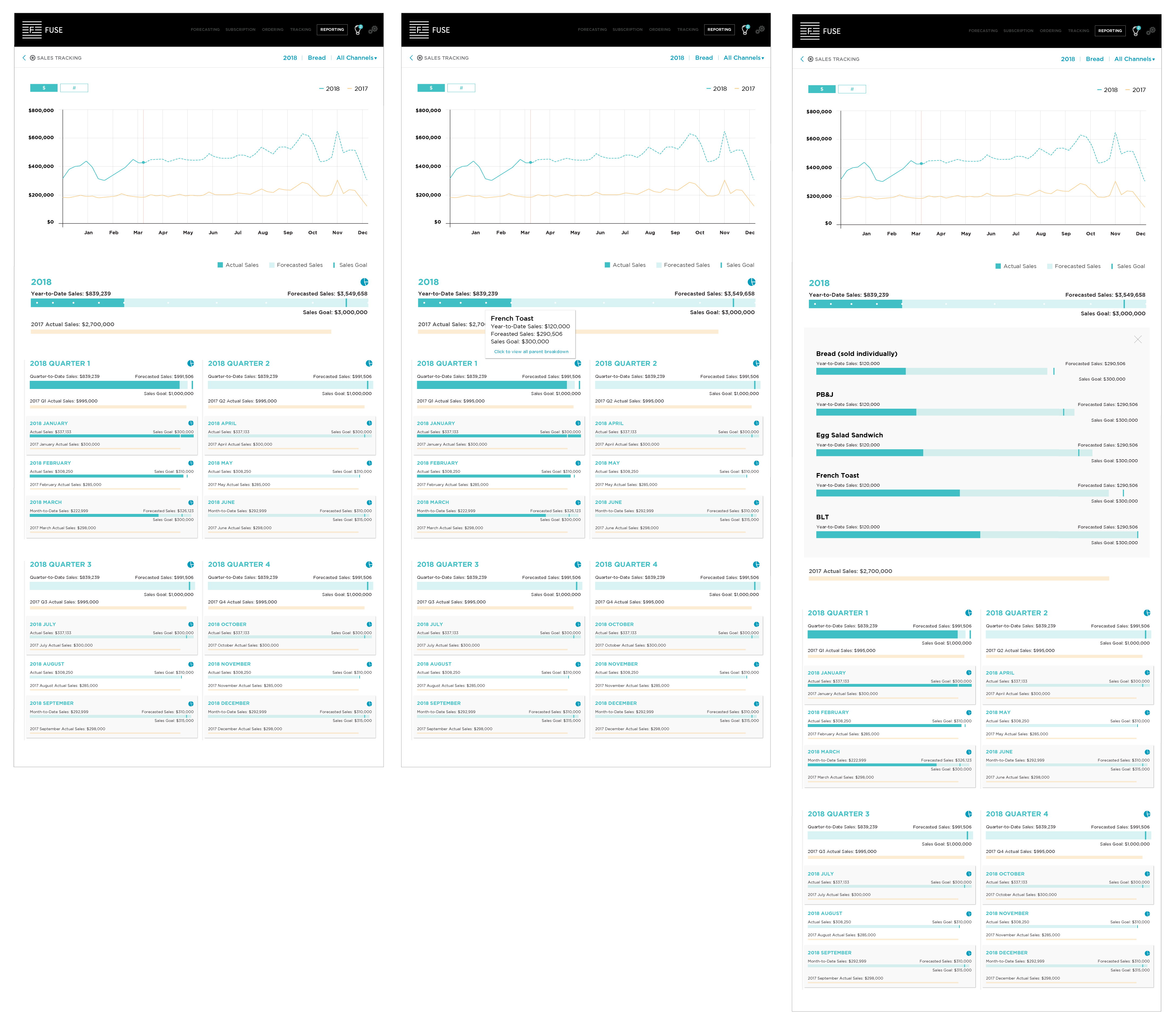
Image 6 provides examples of this in practice.
The toggle allowing users to show or hide data from the previous year employs familiar visual cues and common icons. This approach, commonly used across many websites, highlights the active option in full opacity and the inactive option in reduced opacity.
Further down the page, where sales tracking is segmented into time intervals, I initially hid the "Month" sections by default. Arrows placed next to the "Month" labels indicate that these sections can be expanded. Similar treatment was applied to the "Quarter" sections. Given that only past dates have actual sales data while every week, month, and quarter includes forecasted sales and goals, I opted to expand only quarters with actual sales tracking by default. Thus, in Image 6, the sections for Quarters 3 and 4 are initially hidden but expandable with a click on the arrow.
I utilized a similar arrow interaction for the parent/component section, but this segment of the page was expanded by default. My approach aimed to minimize cognitive load by allowing users the freedom to interact with elements in a way that best suits them, without overwhelming them with excessive content or unnecessary choices.
Image 5 – Toggle for previous year data
Trying a new approach to parent/component info
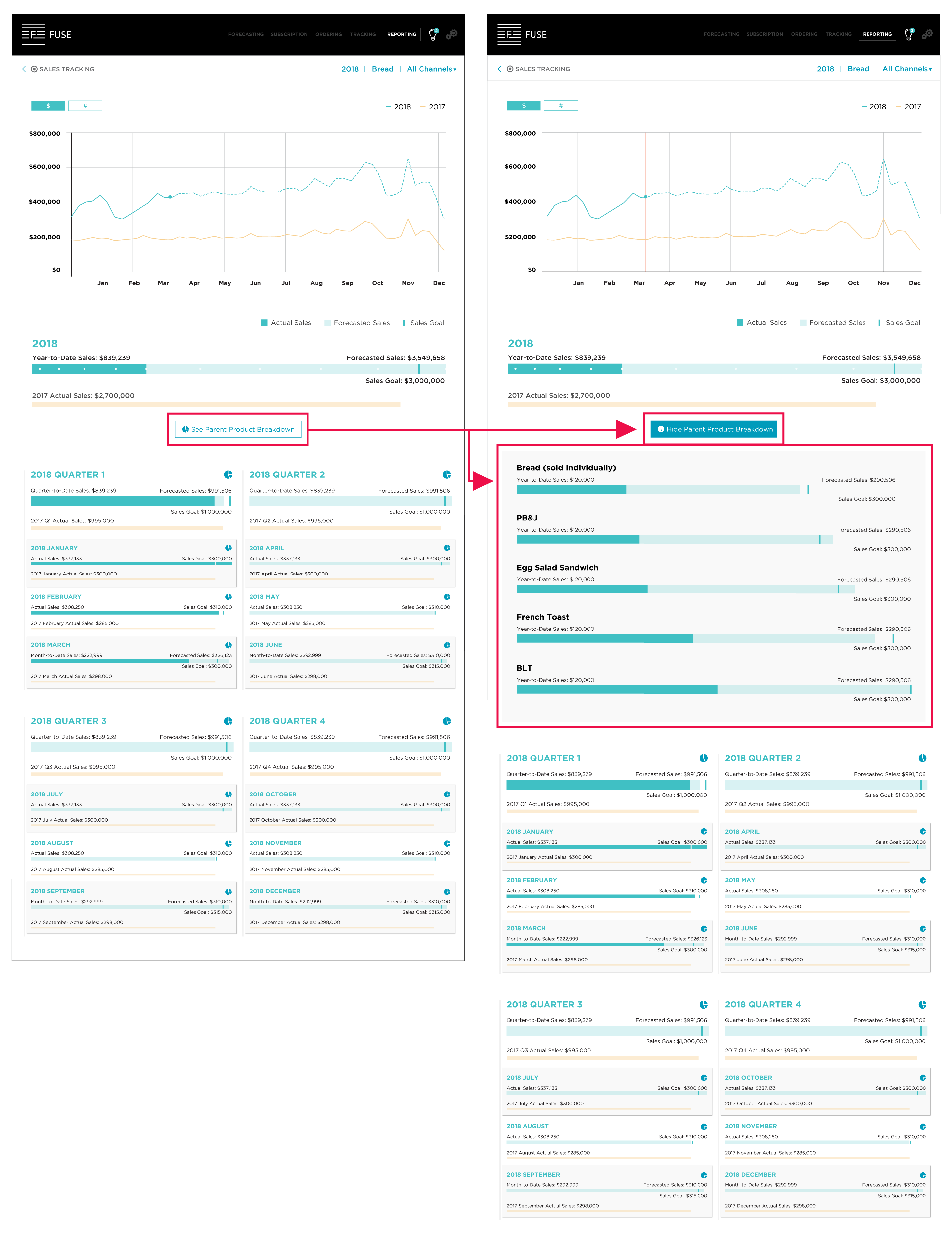
The next iteration (in Image 5) is significantly different from the previous ones. Many of the modifications were made based on feedback from the contractor who hired me and was overseeing the project. Notably, white dots were added to the year-to-date (YTD) bar, and icons were introduced in both the YTD section and in each of the quarter and month sections—all of which are now expanded by default.
The white dots were meant to represent each parent product.
Another recommended change was to add a hover interaction so that upon hovering over a white dot, a tooltip would appear with info on the parent product and a link to click to see all of the parent product info (shown in the third artboard on the far right).
I expressed concerns about all of these additions to the visual design and interactions. These interactions seemed opaque and unintuitive, especially since they're not common across other websites.
When I received pushback, I mocked up the interactions as suggested as well as mocking up my proposed design. After seeing both options mocked up, my proposal was accepted
Image 6 – White dots on the year-to-date (YTD) bar representing parent products and the associated interaction
Access to parent and component information
Another suggestion I received involved adding an icon (the pie chart) that was meant to communicate the existence of parent and/or component product data. When a user clicked on the icon, the parent and/or component data would be revealed. My pushback here was the same as that previously mentioned.
I pushed back again, advocating for the user and highlighting the need for intuitive interactions and visuals. Some things can’t be conveyed with one single, simple image, and I think the existence of parent and/or component product data is one of them.
To demonstrate the issues, I mocked up a version following the contractor's recommendation but also created a version I believed better met user needs.
While the lead designer agreed that the icon wasn’t sufficiently clear by itself, she still wanted to try and make it work because we needed something that could be used for the time interval sections. If we didn’t use the icon, how would we indicate that parent and/or component data was available by quarter, month, and week?
My solution was to create a button with text and the icon that would allow users to toggle between having parent product info visible and hidden. Still unsatisfied with the lack of intuitiveness and ease of use, I continued to iterate on this. The result is shown in image 7.
Image 7 – Interaction to access parent product information
Sales tracking for parent products whose components are variables
For this part of the design, I kept the interactions consistent with the last set of mockups and really only had to focus on how to present data for variable component products. To be a variable there would have to be at least two options but there was no ceiling on so I needed to ensure that my choice would be scalable.
I chose a bar graph because they’re offer a simple way of visualizing categorical data. I went with a horizontal layout instead of a vertical one because:
- Labels are easier to display
- They work better with large datasets and narrow layouts
- It was consistent with other elements on the page like the sales bars for YTD, quarter, etc.
Image 8 - Mockup of parent product (PB&J) (in $) with variable component product information button and interaction
Designing for products that have parents and components
This was one of the areas of greatest complexity. Below are some of the iterations on the design to enable users to dive into information on totals as well as that on parent products and their components, including some with variables.
Image 9 - Final pattern for parent and component product interactions
Image 10 - Final pattern for time interval interactions
Conclusion
This project provided me with the opportunity to do the kind of creative problem solving I love and allowed me to use my psychology background in ways that other projects haven’t.
Design inarguably impacts the world in myriad ways and designers have an obligation to try to better that world through their work. One way of doing this is practicing and promoting accessibility for all. In hindsight I’ve realized that I should have been more of an advocate for accessible design on this project, and that’s one of many lessons I learned through this process.
Thanks so much for reading!